5 Visualizing big data
One of the most effective ways to explore big data, interpret variables, and communicate results obtained from big data analyses to varied audiences is through data visualization. When we deal with big data, we can benefit from data visualizations in many ways, such as:
- understanding the distributional characteristics of variables,
- detecting data entry issues,
- identifying outliers in the data,
- understanding relationships among variables,
- selecting suitable variables for data analysis (a.k.a., feature extraction),
- examining the outcomes of predictive models (e.g., accuracy and overfit), and
- communicating the results to various audiences.
Developing effective visualizations requires identifying the goals and design of data analysis clearly. Sometimes we may already know the answers for some questions about the data; in other cases, we may want to explore further and understand the data in order to generate better insights into the next steps of data analysis. In this process, we need to consider many elements, such as types of variables to be used, axes, labels, legends, colors, and so on. Furthermore, if we aim to present the visualization to a particular audience, then we also need to consider the usability and interpretability of the visualization for the target audience.
The development of an effective data visualization typically includes the following steps:
- Determine the goal of data visualization (e.g., exploring data, relationships, model outcomes)
- Prepare the data (e.g., clean, organize, and transform data)
- Identify the ideal visualization tool based on the goal of data visualization
- Produce the visualization
- Interpret the information in the visualization and present it to your target audience
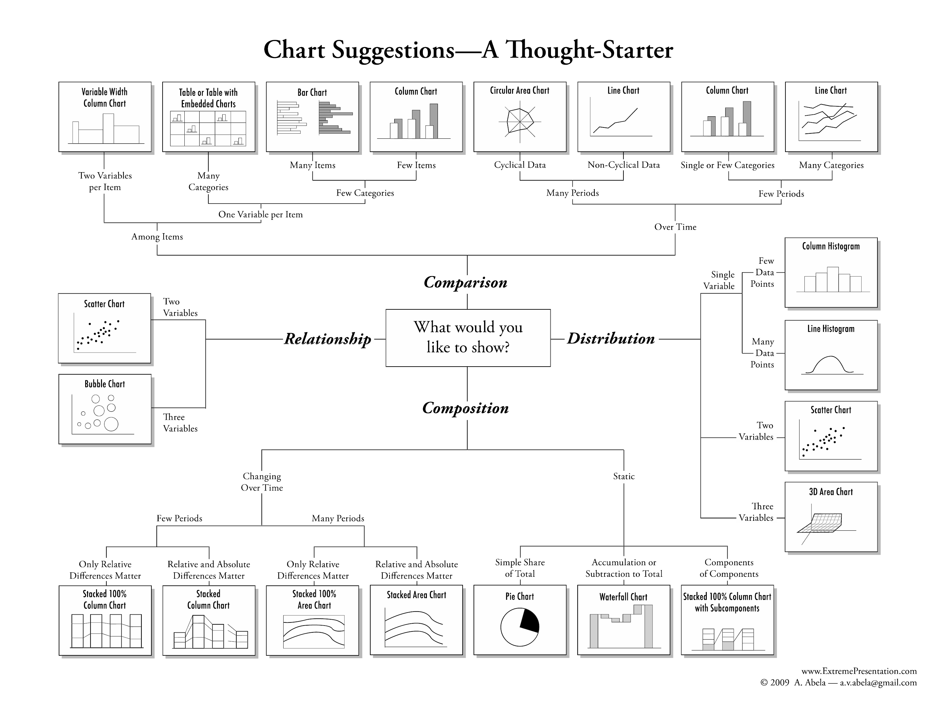
Figure 5.1: Chart suggestions (Source: https://extremepresentation.com/)
Figure 5.1 shows some suggestions for visualizing data based on the type of variables and the purpose of the visualization. In R, almost all of these visualizations can be created very easily, although preparing the data for these visualizations is sometimes quite tedious.
In this section of our session, we will review data visualization tools in R that can help us organize big data, interpret variables, and identify potential variables for predictive models. The first part will focus on data visualizations using the ggplot2 package. Furthermore, we will use other R packages (e.g., GGally, ggExtra, and ggalluvial) that expand the capabilities of ggplot2 even further (also see https://exts.ggplot2.tidyverse.org/gallery/ for more extensions of ggplot2). In the second part, we will discuss web-based, interactive visualizations and dashboards using plotly.
As we review data visualization tools, we will also demonstrate how to use each visualization tool in R and produce sample plots and graphics using the pisa dataset. Furthermore, we will ask you to work on short exercises where you will need to use the functions and packages presented in this section in order to generate your own plots and visualizations using the pisa dataset.
Before we begin, let’s install and load all of the R packages that we will use in this section:
# Install and load the packages one by one.
install.packages("ggplot2")
install.packages("GGally")
install.packages("ggExtra")
install.packages("ggalluvial")
install.packages("plotly")

library("ggplot2")
library("GGally")
library("ggExtra")
library("ggalluvial")
library("plotly")

# Or, just simply run the following to install and load all packages:
dataviz_packages <- c("ggplot2", "GGally", "ggExtra", "ggalluvial", "plotly")
install.packages(dataviz_packages)
lapply(packages, require, character.only = TRUE)

# Load already installed packages
library("data.table")

# we will also use cowplot later in this session.
# Please install it but do not load it for now.
install.packages("cowplot")
5.1 Introduction to ggplot2
This section will demonstrate how to visualise your big data using ggplot2 and other R packages that rely on ggplot2. We use `ggplot2 because it is the most elegant and versatile visualization package in R. Also, it implements a simple grammar of graphics for building a variety of visualizations for either small or large data. This enables creating high-quality plots for publications and presentations easily, with minimal amounts of adjustments and tweaking.
A typical ggplot2 template ranges from a few layers to many layers, depending on the complexity of the visualization of interest. Layers generate a plot and plot transformations within the plot. We can combine multiple layers using the + operator. Therefore, plots are built step by step by adding new elements in each layer. A simple ggplot2 template is shown below:
ggplot(data = my_data,
       mapping = aes(x = var1, y = var2)) +
  geom_function()
where the ggplot function uses the two variables (var1 and var2) from a dataset (my_data), and draws a new plot based on a particular geom function (geom_function). Selecting the variables to be plotted is done through the aesthetic mapping (via the aes function). Depending on the aesthetic mapping of interest, we can split the plot, add colors by a group variable, change the labels for each axis, change the font size, and so on. The `ggplot2 package offers many geom functions to draw different types of plots:
geom_pointfor scatter plots, dot plots, etc.geom_boxplotfor boxplotsgeom_linefor trend lines, time series, etc.
In addition, functions such as theme_bw() and theme() enable adjusting the theme elements (e.g., font size, font type, background colors) for a given plot. As we create plots in our examples, we will use some of these theme elements to make our plots look nicer.
An important caveat in visualizing big data is that the size of the dataset (especially the number of rows) and complexity level of the plot (e.g., additional lines, colors, facets) will influence how quickly and successfully ggplot2 can render the desired plot. Nobody can absorb the meaning of thousands of data points presented on a single visualization. Therefore, in some cases we will need to find a way to cluster or reduce the magnitude of items to visualize before we render the visualization. Typically we can achieve this by:
- taking smaller, sometimes random, samples from our big data, or
- summarizing our big data using categorical, group variables (e.g., gender, grade, year).
5.2 Marginal plots
We can use marginal plots to examine the distributions of individual variables in a large dataset. A typical marginal plot is a scatter plot that also has histograms or boxplots in the margins of the x- and y-axes. In this section, first we will create histograms and boxplots for the variables in the pisa dataset. Then, we will review other options where we will combine multiple variables and different types of plots in a single visualization.
To demonstrate data visualizations, we will first take a subset of the pisa dataset by selecting some countries and some variables of interest. The selected variables are shown below.
| Variable | Description | Variable | Description |
|---|---|---|---|
| CNT | Country | BELONG | Sense of belonging to school |
| OECD | OECD membership | EMOSUPS | Parents emotional support |
| CNTSTUID | Student ID | HOMESCH | ICT use outside of school for schoolwork |
| W_FSTUWT | Student weight in the PISA database | ENTUSE | ICT use outside of school leisure |
| ST001D01T | Grade level | ICTHOME | ICT available at home |
| ST004D01T | Gender (female/male) | ICTSCH | ICT availability at school |
| ST011Q04TA | Possessing a computer at home | WEALTH | Family wealth |
| ST011Q05TA | Possessing educational software at home | PARED | Highest parental education in years of schooling |
| ST011Q06TA | Having internet access at home | TMINS | Total learning time per week |
| ST071Q02NA | Additional time spent for learning math | ESCS | Index of economic, social and cultural status |
| ST071Q01NA | Additional time spent for learning science | TDTEACH | Teacher-directed science instruction |
| ST123Q02NA | Whether parents support educational efforts and achievements | IBTEACH | Inquiry based science instruction |
| ST082Q01NA | Prefering working as part of a team to working alone | TEACHSUP | Teacher support in science classes |
| ST119Q01NA | Wanting top grades in most or all courses | SCIEEFF | Science self-efficacy |
| ST119Q05NA | Wanting to the best student in class | math | Students math scores in PISA 2015 |
| ANXTEST | Test anxiety | reading | Students reading scores in PISA 2015 |
| COOPERATE | Enjoying cooperation | science | Students science scores in PISA 2015 |
Here we filter our big data based on a list of countries (we called country), select the variables that we have just identified in Table 5.1 and the reading, math, and science scales we created earlier.
country <- c("United States", "Canada", "Mexico", "B-S-J-G (China)", "Japan",
             "Korea", "Germany", "Italy", "France", "Brazil", "Colombia", "Uruguay",
             "Australia", "New Zealand", "Jordan", "Israel", "Lebanon")

dat <- pisa[CNT %in% country,
            .(CNT, OECD, CNTSTUID, W_FSTUWT, sex, female,
              ST001D01T, computer, software, internet,
              ST011Q05TA, ST071Q02NA, ST071Q01NA, ST123Q02NA,
              ST082Q01NA, ST119Q01NA, ST119Q05NA, ANXTEST,
              COOPERATE, BELONG,  EMOSUPS, HOMESCH, ENTUSE,
              ICTHOME, ICTSCH, WEALTH, PARED, TMINS, ESCS,
              TEACHSUP, TDTEACH, IBTEACH, SCIEEFF,
              math, reading, science)
            ]
Next, we create additional variables by recoding some of the existing variables. The goal is to create some numerical variables out of the character variables in case we want to use them in the modeling stage.
# Let's create additional variables that we will use for visualizations
dat <- dat[, `:=` (
  # New grade variable
  grade = (as.numeric(sapply(ST001D01T, function(x) {
  if(x=="Grade 7") "7"
  else if (x=="Grade 8") "8"
  else if (x=="Grade 9") "9"
  else if (x=="Grade 10") "10"
  else if (x=="Grade 11") "11"
  else if (x=="Grade 12") "12"
  else if (x=="Grade 13") NA_character_
  else if (x=="Ungraded") NA_character_}))),
  # Total learning time as hours
  learning = round(TMINS/60, 0),
  # Regions for selected countries
  Region = (sapply(CNT, function(x) {
  if(x %in% c("Canada", "United States", "Mexico")) "N. America"
    else if (x %in% c("Colombia", "Brazil", "Uruguay")) "S. America"
    else if (x %in% c("Japan", "B-S-J-G (China)", "Korea")) "Asia"
    else if (x %in% c("Germany", "Italy", "France")) "Europe"
    else if (x %in% c("Australia", "New Zealand")) "Australia"
    else if (x %in% c("Israel", "Jordan", "Lebanon")) "Middle-East"
    }))
  )]
Now, let’s see the number of rows in the final dataset and print the first few rows of the selected variables.
# N count for the final dataset
dat[,.N] # 158,061 rows
## [1] 158061# Let's preview the final data
head(dat)## CNT OECD CNTSTUID W_FSTUWT sex female ST001D01T computer software
## 1: Australia Yes 3610676 28.20 Female 1 Grade 10 1 1
## 2: Australia Yes 3611874 28.20 Female 1 Grade 10 1 1
## 3: Australia Yes 3601769 28.20 Female 1 Grade 10 1 1
## 4: Australia Yes 3605996 28.20 Female 1 Grade 10 1 1
## 5: Australia Yes 3608147 33.45 Male 0 Grade 10 1 1
## 6: Australia Yes 3610012 33.45 Male 0 Grade 10 1 1
## internet ST011Q05TA ST071Q02NA ST071Q01NA ST123Q02NA ST082Q01NA
## 1: 1 Yes 0 1 Disagree Disagree
## 2: 1 Yes 1 1 Agree Agree
## 3: 1 Yes NA NA Agree Strongly disagree
## 4: 1 Yes 5 7 Strongly agree Strongly disagree
## 5: 1 Yes 1 1 Agree Agree
## 6: 1 Yes 2 2 Agree Agree
## ST119Q01NA ST119Q05NA ANXTEST COOPERATE BELONG EMOSUPS HOMESCH
## 1: Agree Strongly agree -0.1522 0.2085 0.5073 -2.2547 -0.1686
## 2: Agree Disagree 0.2594 -0.2882 -0.8021 -0.2511 0.0302
## 3: Strongly agree Disagree 2.5493 -1.2109 -2.4078 -1.9895 1.2836
## 4: Strongly agree Strongly agree 0.2563 0.3950 -0.3381 1.0991 -0.0498
## 5: Agree Disagree 0.4517 -1.3606 -0.5050 -1.3298 -0.3355
## 6: Agree Agree 0.5175 0.4252 -0.0099 -0.4263 0.1567
## ENTUSE ICTHOME ICTSCH WEALTH PARED TMINS ESCS TEACHSUP TDTEACH IBTEACH
## 1: -0.7369 4 5 0.0592 12 1400 0.4078 NA NA NA
## 2: -0.1047 9 6 0.7605 12 1100 0.4500 0.3574 0.0615 0.2208
## 3: -1.5403 11 10 -0.1220 11 1960 -0.5889 -1.0718 -0.6102 -0.2198
## 4: 0.0342 10 7 0.9314 15 2450 0.6498 0.6375 0.7979 -0.0282
## 5: 0.2309 NA 7 0.7905 15 1400 0.7675 0.8213 0.1990 1.1477
## 6: 0.6896 10 5 0.7054 15 1400 1.1151 NA NA NA
## SCIEEFF math reading science grade learning Region
## 1: NA 545.9 586.5 589.6 10 23 Australia
## 2: -0.4041 511.6 570.8 557.2 10 18 Australia
## 3: -0.9003 478.6 570.0 569.5 10 33 Australia
## 4: 1.2395 506.1 531.1 529.0 10 41 Australia
## 5: -0.0746 481.9 506.5 504.2 10 23 Australia
## 6: NA 455.0 456.5 472.6 10 23 AustraliaWe want to see the distributions of the science scores across the 17 countries in our final dataset. The first line with ggplot creates a layout for our figure, the second line draws a box plot using geom_boxplot, the fourth line with labs creates labels of the axes, and the last line with theme_bw removes the default theme with a grey background and activates the dark-on-light ggplot2 theme – which is much better for publications and presentations (see https://ggplot2.tidyverse.org/reference/ggtheme.html for a complete list of themes available in ggplot2).
ggplot(data = dat, mapping = aes(x = CNT, y = science)) +
  geom_boxplot() +
  labs(x=NULL, y="Science Scores") +
  theme_bw()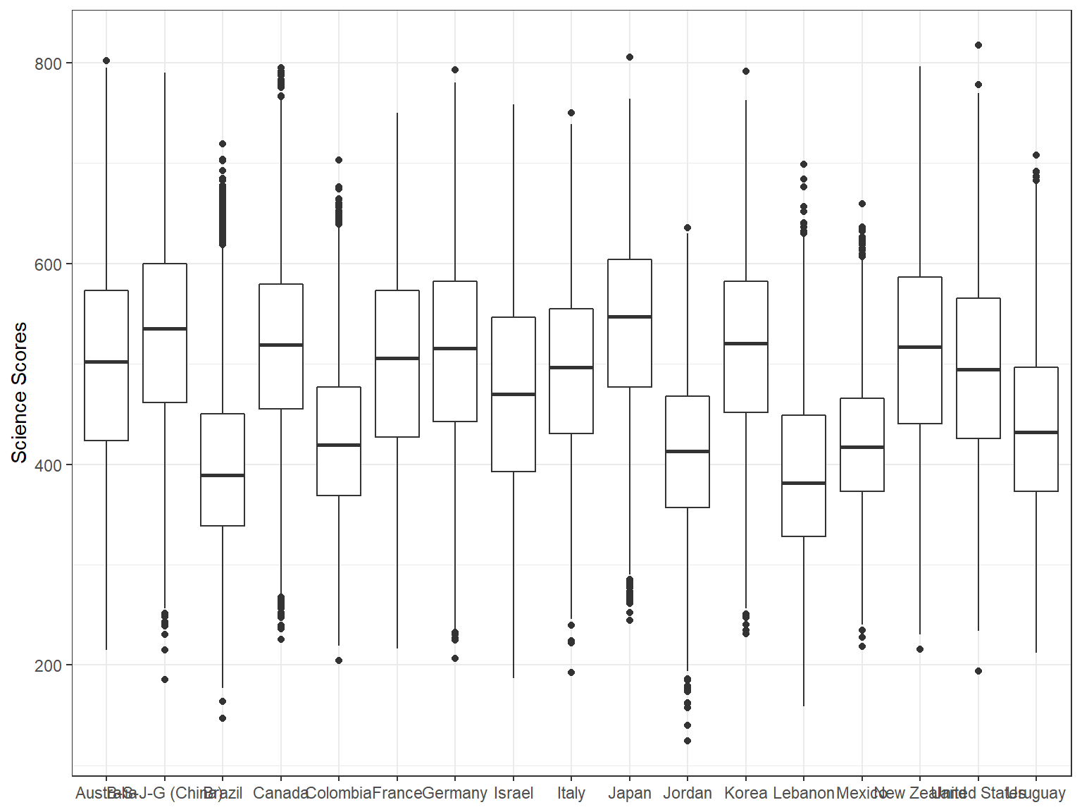
The resulting plot is not necessarily nice because all the country names on the x-axis seem to be squeezed together and thus some of the country names are not visible on the x-axis. To correct this, we may want to flip the coordinates of the plot and use country names on the y-axis instead. The coord_flip() function allows us to achieve that very easily.
ggplot(data = dat,
       mapping = aes(x = CNT, y = science)) +
  geom_boxplot() +
  labs(x=NULL, y="Science Scores") +
  coord_flip() +
  theme_bw()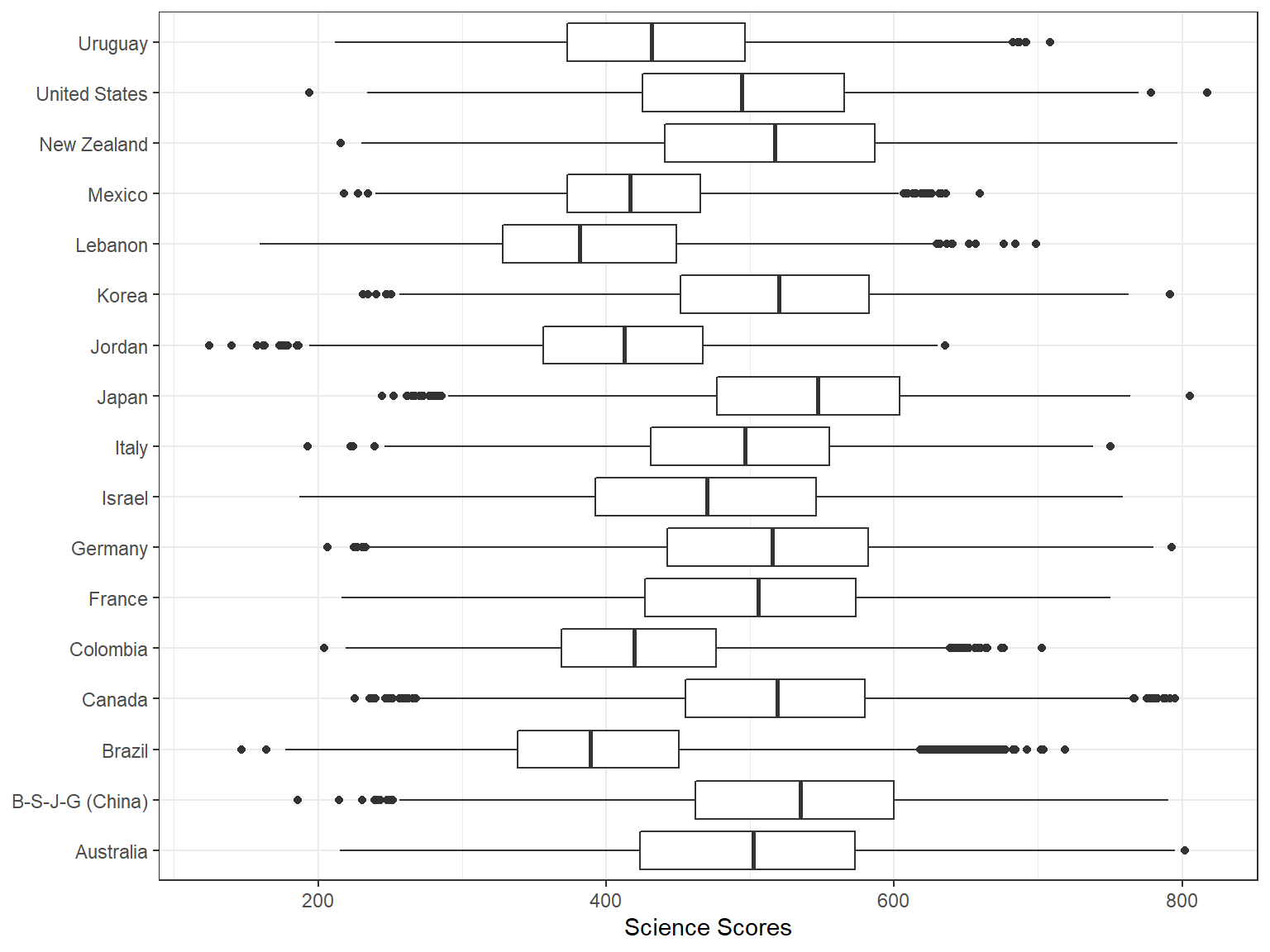
Next, I want to show the mean values in the boxplots since the line in the middle represents the median, not the mean. To achieve this, we first calculate the means by countries.
means <- dat[,
             .(science = mean(science)),
             by = CNT]
Now we can use means to add a point into each boxplot to show the mean score by countries. We will use stat_summary() along with the options colour = "blue", geom = "point" to create a blue point for the mean. In addition, given that the average science score in PISA 2015 was 493 across all participating countries (see PISA 2015 Results in Focus for more details), we can add a reference line into our plot to identify the average score, which would then allow us to visually examine which countries are above or below the average score. To achieve this, we use geom_hline function and specify where it should intersect the plot (i.e., yintercept = 493). We also want the reference line to be a red, dashed-line with a thickness level of 1 – to make it more visible in the plot. Finally, to facilitate the interpretation of the plot, we want the boxplots to be ordered based on the average scores for each country and thus we add reorder(CNT, science) into the mapping.
ggplot(data = dat,
       mapping = aes(x = reorder(CNT, science), y = science)) +
  geom_boxplot() +
  stat_summary(fun.y = mean, colour = "blue", geom = "point",
               shape = 18, size = 3) +
  labs(x=NULL, y="Science Scores") +
  coord_flip() +
  geom_hline(yintercept = 493, linetype="dashed", color = "red", size = 1) +
  theme_bw()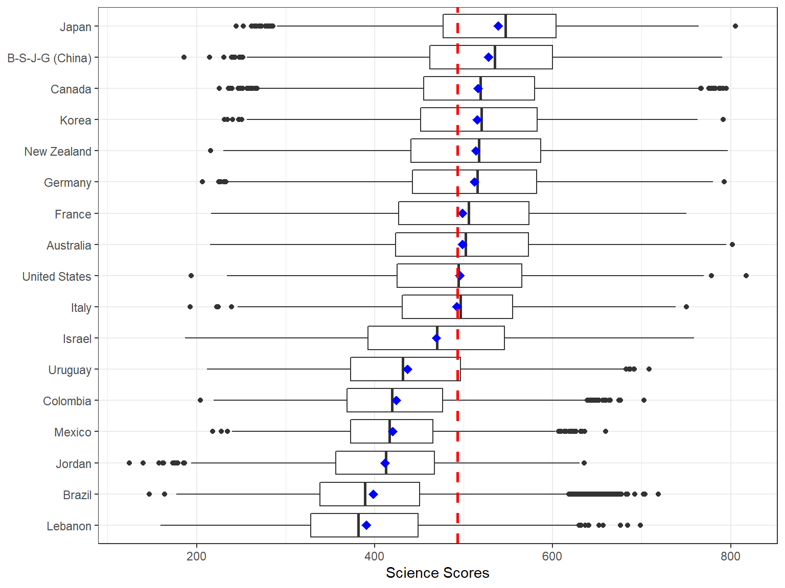
Now let’s add some colors to our figure based on the region where each country is located. In order to do this, we use the region variable to fill the boxplots with color, using fill = Region.
ggplot(data = dat,
       mapping = aes(x = reorder(CNT, science), y = science, fill = Region)) +
  geom_boxplot() +
  labs(x=NULL, y="Science Scores") +
  coord_flip() +
  geom_hline(yintercept = 493, linetype="dashed", color = "red", size = 1) +
  theme_bw()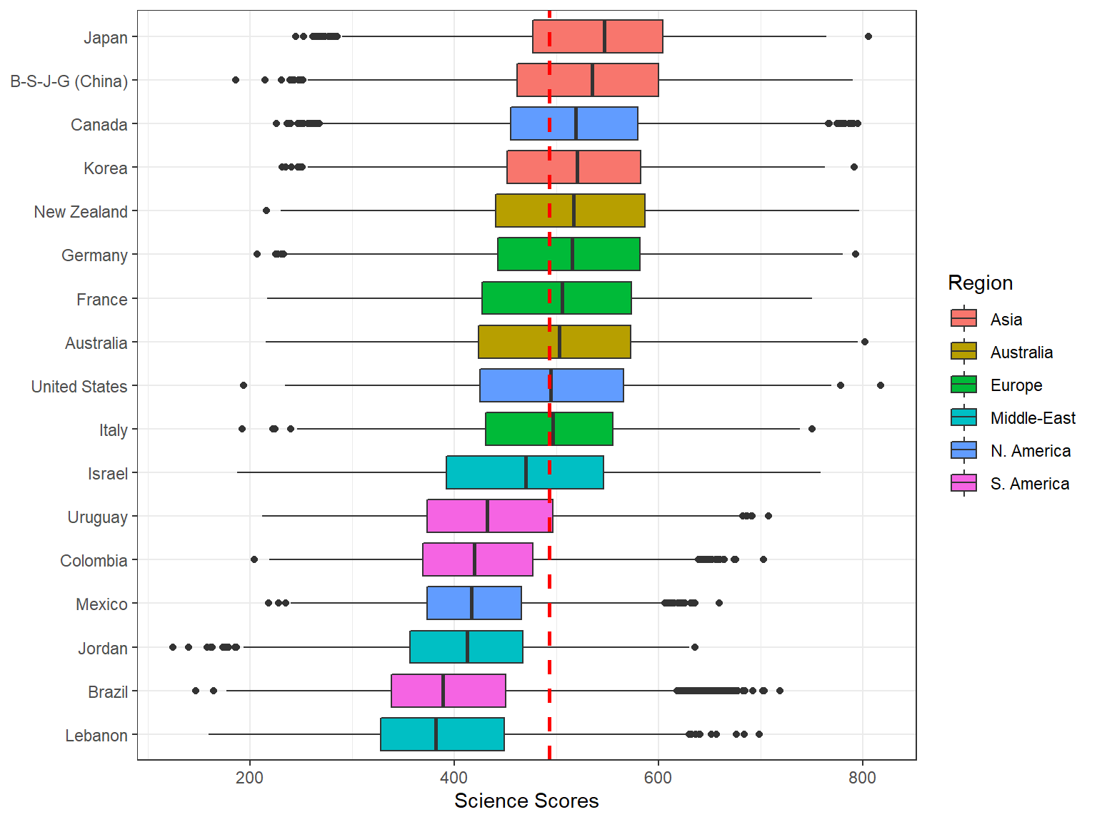
5.2.1 Exercise
Create a plot of math scores over countries with different colors based on region. You need to modify the R code below by replacing geom_boxplot with:
geom_point(aes(color = Region)), and thengeom_violin(aes(color = Region)).
How long did it take to create both plots? Which one is a better way to visualize this type of data?
ggplot(data = dat,
       mapping = aes(x = reorder(CNT, math), y = math, fill = Region)) +
  geom_boxplot() +
  labs(x=NULL, y="Math Scores") +
  coord_flip() +
  geom_hline(yintercept = 490, linetype="dashed", color = "red", size = 1) +
  theme_bw()
We can also create histograms (or density plots) for a particular variable and split the plot into multiple plots by using a categorical, group variable. In the following example, we use x = Region in the mapping in order to identify different regions in the distribution of the science scores. In addition, we use facet_grid(. ~ sex) to generate separate histograms by gender. Note that we also added title = "Science Scores by Gender and Region" as a title in the labs function.
ggplot(data = dat,
       mapping = aes(x = science, fill = Region)) +
  geom_histogram(alpha = 0.5, bins = 50) +
  labs(x = "Science Scores", y = "Count",
       title = "Science Scores by Gender and Region") +
  facet_grid(. ~ sex) +
  theme_bw()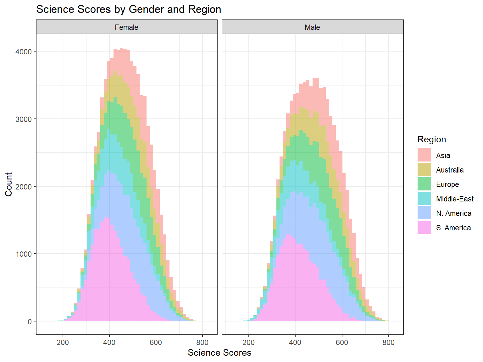
If we are interested in visualizing multiple variables, plotting each variable individually can be time consuming. Therefore, we can use the ggpairs function from the GGally package to build a more complex, diagnostic plot for multiple variables.
In the following example, we plot reading, science, and math scores as well as gender (i.e., sex) in the same plot. Because our dataset is quite large, plotting all the data points would result in a highly complex plot where most data points would overlap on each other. Therefore, we will take a random sample of 500 cases from each region defined in the data, save this smaller dataset as dat_small, and use this dataset inside the ggpairs function. We colorize each variable by region (using mapping = aes(color = Region)). The resulting plot shows density plots for the continuous variables (by region), a stacked bar chart for gender, and box plots for the continuous variables by region and gender.
# Random sample of 500 students from each region
dat_small <- dat[,.SD[sample(.N, min(500,.N))], by = Region]

ggpairs(data = dat_small,
        mapping = aes(color = Region),
        columns = c("reading", "science", "math", "sex"),
        upper = list(continuous = wrap("cor", size = 2.5))
        )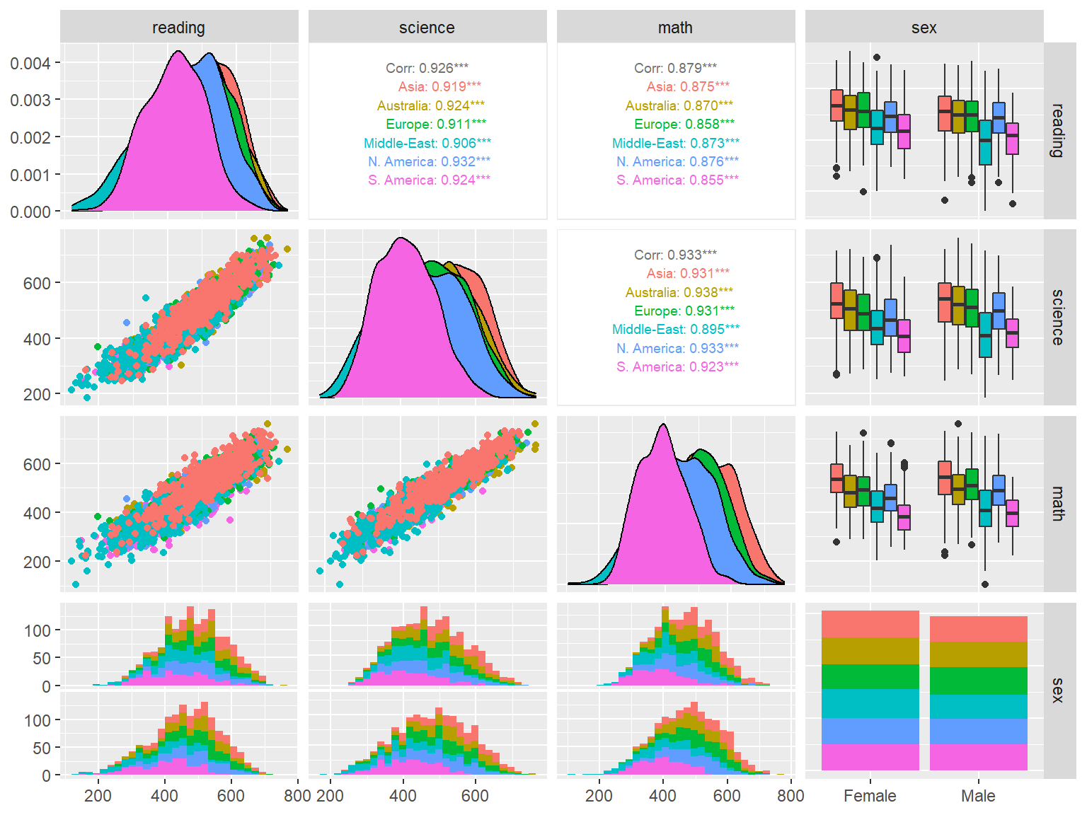
Interpretation:
- What can we say about the regions based on the plots above?
- Do you see any major gender differences for reading, science, or math?
- What is the relationship among reading, science, or math?
5.3 Conditional plots
When we deal with continuous variables, an effective way to understand the relationship between the variables is to produce conditional plots, such as scatterplots, dotplots, and bubble charts. Simple scatterplots in R can be created using plot(var1, var2, data = name_of_dataset). Using the extended capabilities of ggplot2 via the ggExtra package, we can combine histograms and density plots with scatterplots and visualize them together.
In the following example, we first create a scatterplot of learning time per week and science scores using ggplot. We use geom_point to draw a plot with points and geom_smooth(method = "loess") to add a regression line with loess smoothing (i.e., Locally Estimated Scatterplot Smoothing). We save this plot as p1 and then pass it to ggMarginal to transform the plot into a marginal scatterplot. Inside ggMarginal, we use type = "histogram" to create histograms for learning time per week and science scores on the x and y axes of the plot. Note that as the plot is created, you may see some warning messages, such as “Removed 750 rows containing missing values,” because some variables have missing rows in the dataset.
p1 <- ggplot(data = dat_small,
             mapping = aes(x = learning, y = science)) +
  geom_point() +
  geom_smooth(method = "loess") +
  labs(x = "Weekly Learning Time", y = "Science Scores") +
  theme_bw()

# Replace "histogram" with "boxplot" or "density" for other types
ggMarginal(p1, type = "histogram")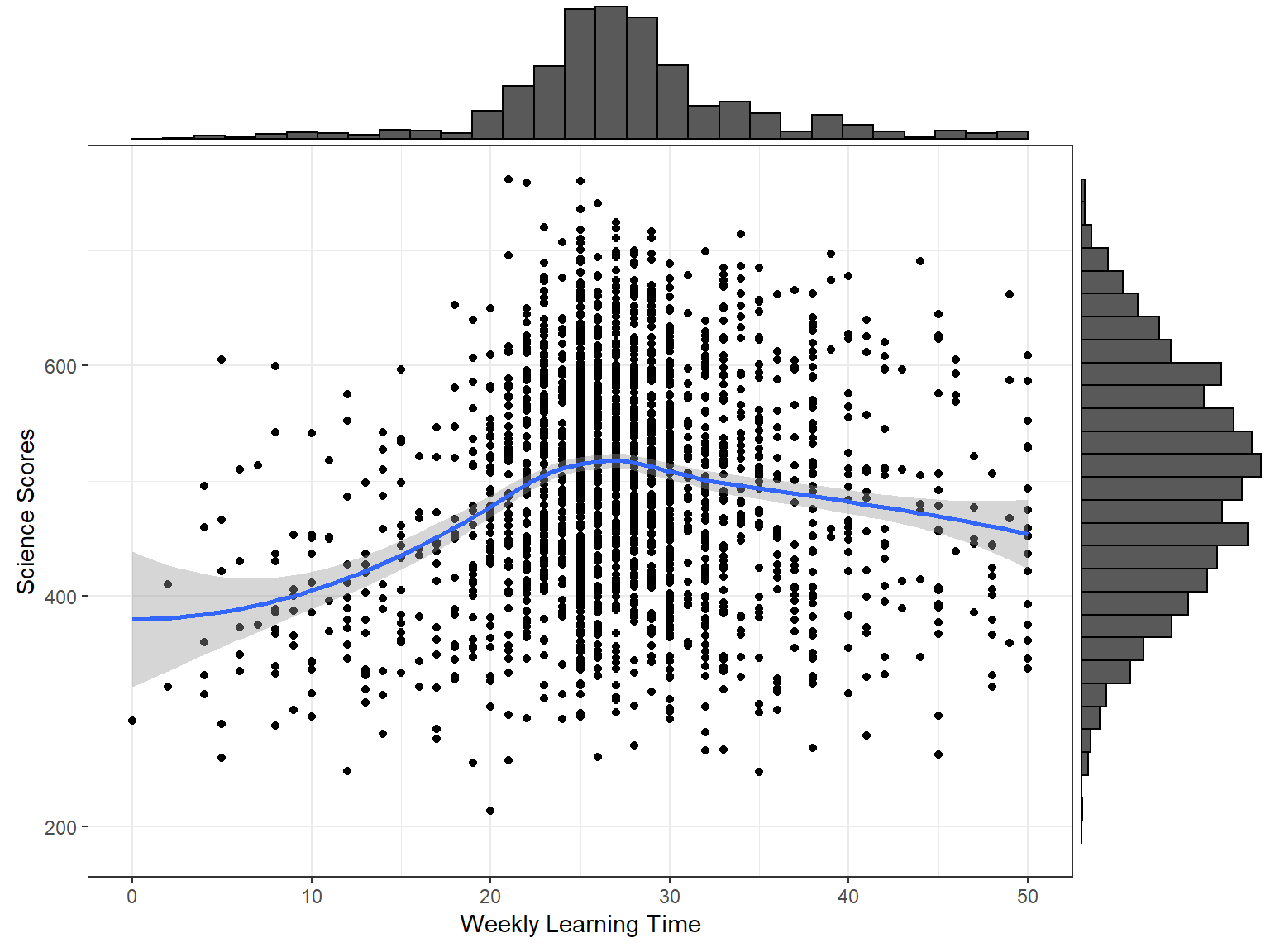
We can also distinguish male and female students in the plot and create a scatterplot of learning time and science scores with densities by gender. To achieve this, we add colour = sex into the mapping of ggplot and change the type of plot to type = "density" in ggMarginal. In addition, we use groupColour = TRUE, groupFill = TRUE inside ggMarginal to use separate colors for each gender in the density plots.
p2 <- ggplot(data = dat_small,
             mapping = aes(x = learning, y = science,
                           colour = sex)) +
  geom_point() +
  geom_smooth(method = "loess") +
  labs(x = "Weekly Learning Time", y = "Science Scores") +
  theme_bw() +
  theme(legend.position = "bottom",
        legend.title = element_blank())

ggMarginal(p2, type = "density", groupColour = TRUE, groupFill = TRUE)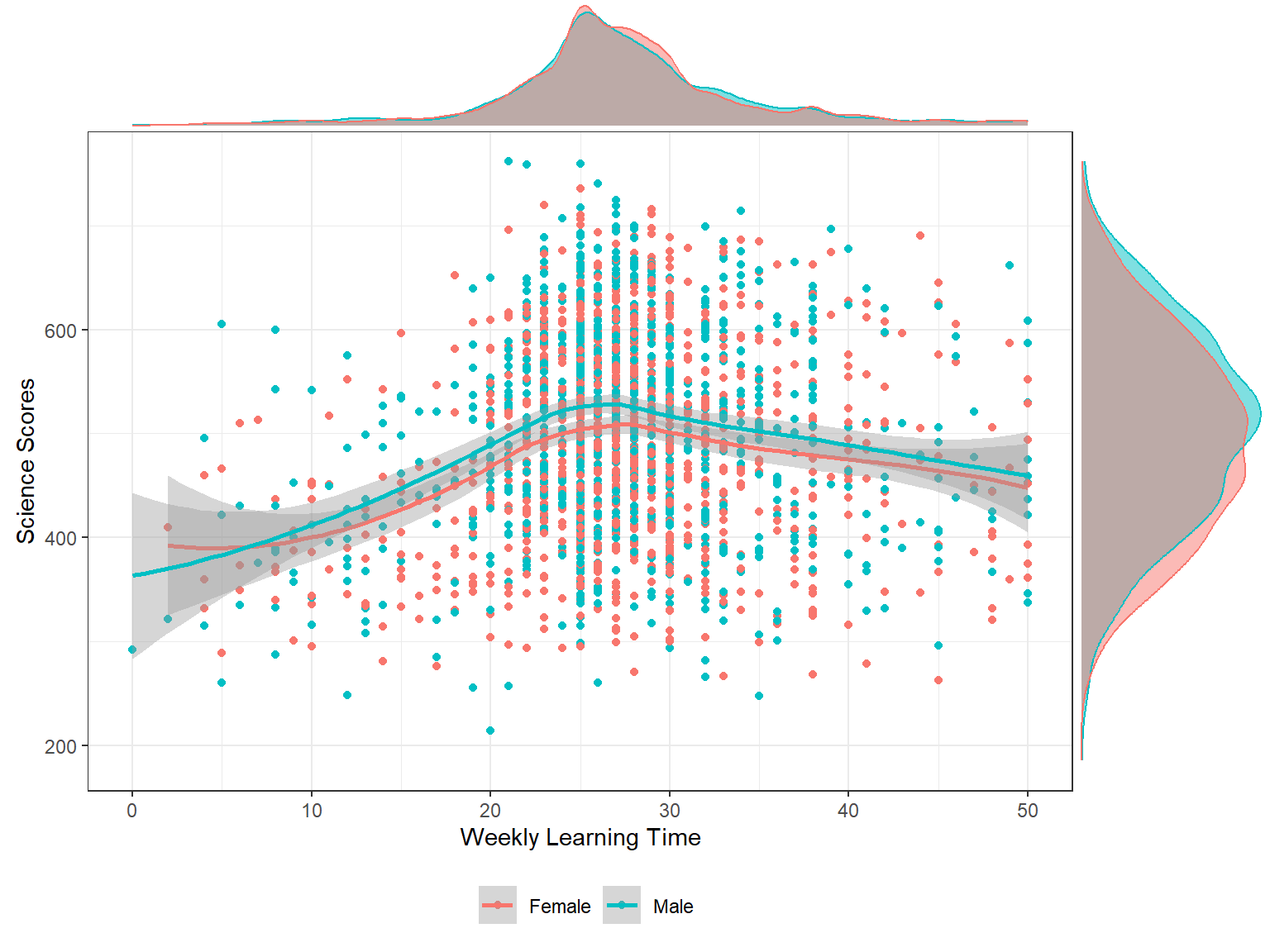
Interpretation:
- What can we say about the relationship between weekly learning time and science scores?
- Do you see any gender differences?
Now let’s incorporate more variables into the plot. This time we are not going to use marginal plots. Instead, we will create a regular scatterplot but add other layers to represent additional variables. In the following example, we examine the relationship between students’ weekly learning time (learning) and science scores (science) across regions (region) and gender (sex). Adding fill = Region into the mapping will allow us to draw regression lines by regions, while adding aes(colour = sex) into geom_point will allow us to use different colors for male and female students in the plot.
ggplot(data = dat_small,
       mapping = aes(x = learning, y = science, fill = Region)) +
  geom_point(aes(colour = sex)) +
  geom_smooth(method = "loess") +
  labs(x = "Weekly Learning Time", y = "Science Scores") +
  theme_bw()
The resulting scatterplot is nice but it is hard to compare the results clearly between gender groups and regions. To improve the interpretability of the plot, we will use the faceting option. This will allow us to split the scatterplot into multiple plots based on gender and region. In the following example, we examine the relationship between students’ learning time and science scores across regions and gender. We use facet_grid(sex ~ Region) to split the plots into multiple rows based on gender and multiple columns based on region.
ggplot(data = dat_small,
       mapping = aes(x = learning, y = science)) +
  geom_point() +
  geom_smooth(method = "loess") +
  labs(x = "Weekly Learning Time", y = "Science Scores") +
  theme_bw() +
  theme(legend.title = element_blank()) +
  facet_grid(sex ~ Region)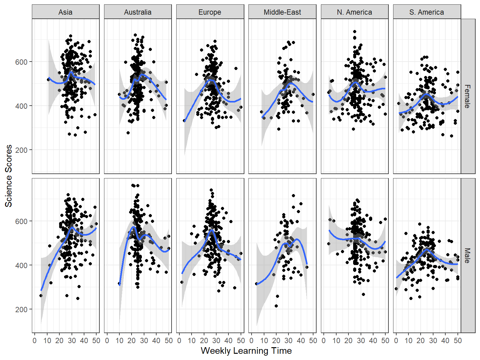
Interpretation:
- Do you see any regional differences?
- Is there any interaction between gender and region?
5.3.1 Exercise
Create a scatterplot of socio-economic status (ESCS) and math scores (math) across regions (region) and gender (sex). Use geom_smooth(method = "lm") to draw linear regression lines (instead of loess smoothing). Do you think that the relationship between ESCS and math changes across gender and regions?
5.4 Plots for examining correlations
For a simple examination of the correlation between two continuous variables, we could just create a scatterplot matrix. In the following plot, we will create a scatterplot matrix of family wealth (WEALTH) and science scores (science) by gender (sex) and region (region). We will use region for facetting and gender for coloring the data points.
ggplot(data = dat_small,
       mapping = aes(x = WEALTH, y = science)) +
  geom_point(aes(color = sex)) +
  facet_wrap( ~ Region) +
  labs(x = "Family Wealth", y = "Science Scores") +
  theme_bw() +
  theme(legend.title = element_blank())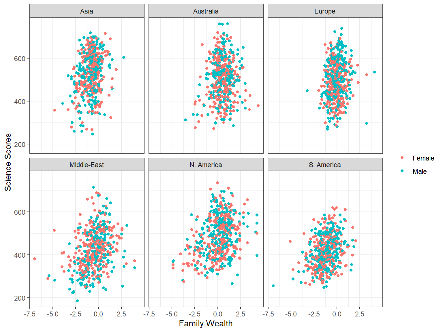
A more effective way for identifying correlated variables in a dataset for further statistical analyses (also known as feature extraction) is to create a correlation matrix plot. The ggcorr() function from the GGally package provides a quick way to make a correlation matrix plot. In the following example, we will create a correlation matrix plot for science, math, reading, ICT possession at home, socio-economic status, family wealth, highest parental education, science self-efficacy, sense of belonging to school, and grade level.
ggcorr(data = dat[,.(science, math, reading, ICTHOME, ESCS,
                     WEALTH, PARED, SCIEEFF, BELONG, grade)],
       method = c("pairwise.complete.obs", "pearson"),
       label = TRUE, label_size = 4)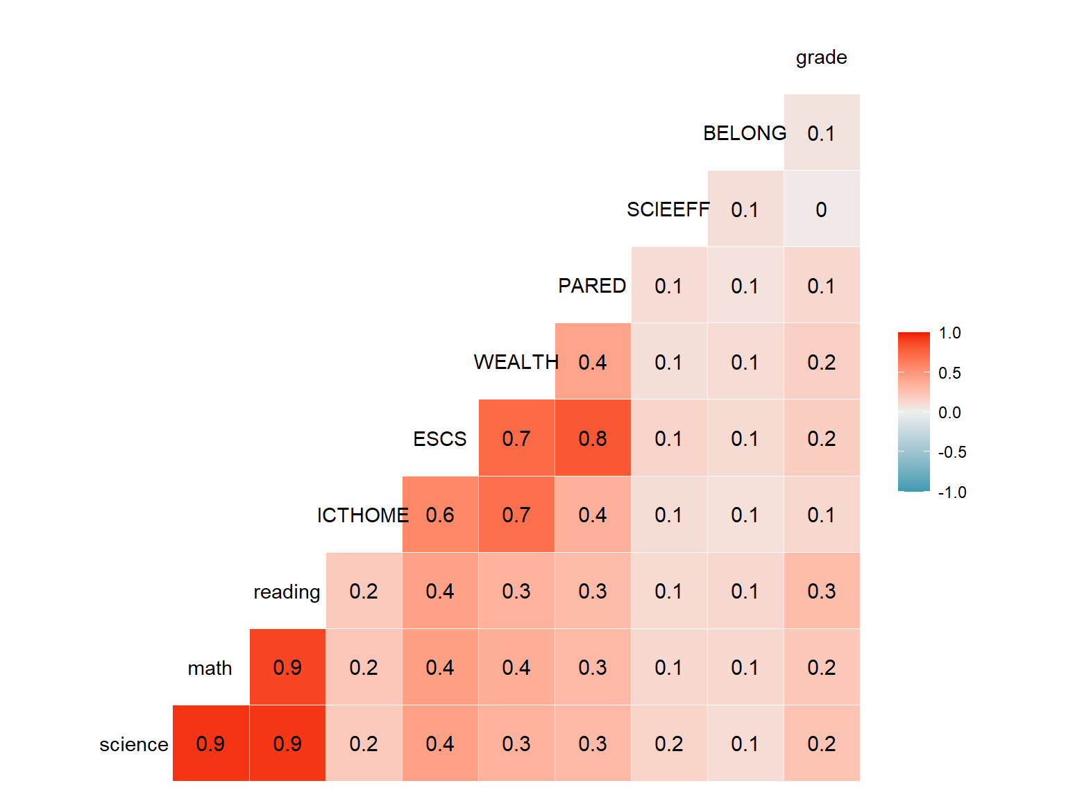
5.5 Plots for examining means by group
Let’s assume that we want to see average science scores by gender and country. First, we need to find the average science scores by country and gender and save them in a new dataset. Below we calculate average science scores and N counts by both gender and country and save the dataset as science_summary.
science_summary <- dat[,
                       .(Science = mean(science, na.rm = TRUE),
                         Freq = .N),
                       by = c("sex", "CNT")]

head(science_summary)
## sex CNT Science Freq
## 1: Female Australia 498.0 7163
## 2: Male Australia 499.4 7367
## 3: Male Brazil 400.8 11068
## 4: Female Brazil 396.3 12073
## 5: Female Canada 515.3 10022
## 6: Male Canada 517.3 10036Now, we can create a simple bar graph summarizing the average science performance by gender and country, using our new dataset.
ggplot(data = science_summary,
       mapping = aes(x = CNT, y = Science, fill = sex)) +
  geom_bar(stat = "identity", position = "dodge") +
  coord_flip() +
  labs(x = "", y = "Science Scores", fill = "Gender") +
  theme_bw()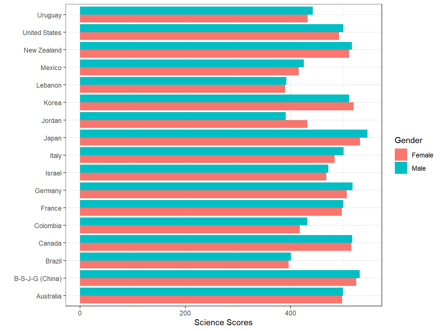
Despite their easiness and simplicity, bar graphs are not necessarily visually appealing. Thus, we will create a bubble chart to visualize the same information in a different way. A bubble chart is essentially a weighted scatterplot where a third variable determines the size of the dots in the plot. In the following bubble chart, we use Freq (i.e., number of students from each country) to determine the size of the dots in the plot, using size = Freq.
ggplot(data = science_summary,
       mapping = aes(x = CNT, y = Science, size = Freq, fill = sex)) +
  geom_point(shape = 21) +
  coord_flip() +
  theme_bw() +
  labs(x = NULL, y = "Science Scores", fill = "Gender",
       size = "Frequency")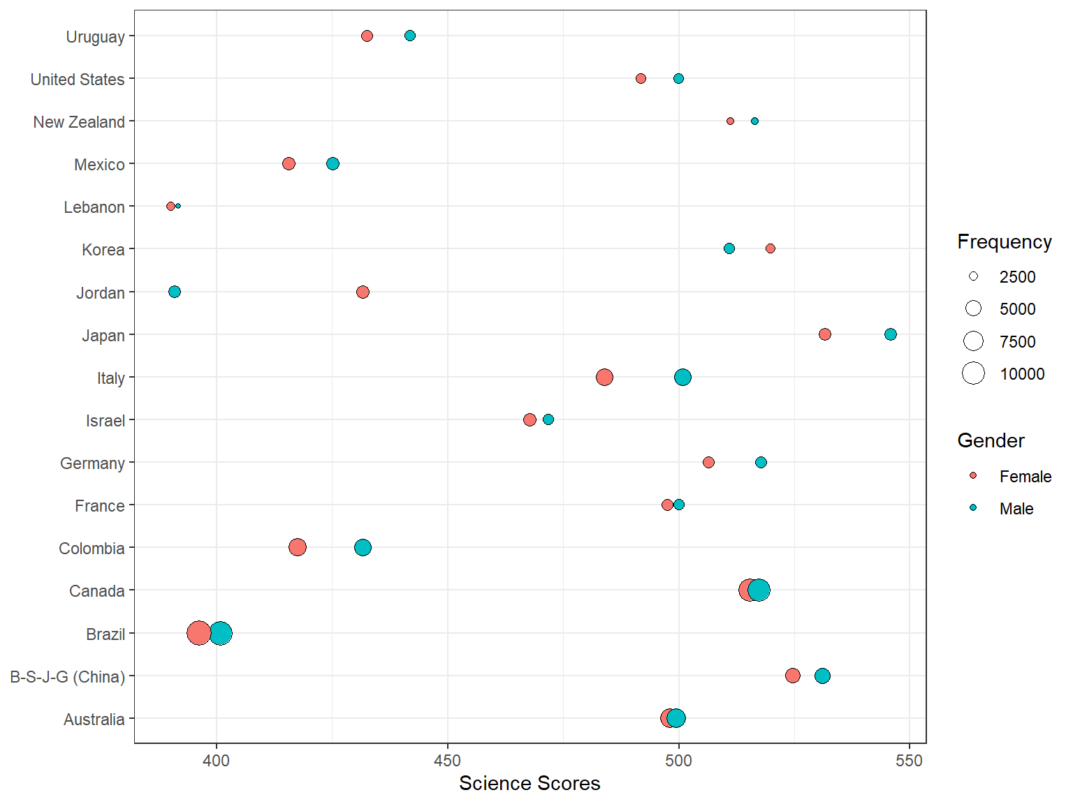
Interpretation:
- Which countries seem to have the highest numbers of students?
- Which countries seem to have the larger achievement gap in science between male and female students?
We can also create a dot plot, which is very similar to the bubble chart when one of the variables is categorical, to convey the same information even more effectively. As you will see, this is a more polished version of the bubble chart with additional titles and subtitles.
ggplot(data = science_summary, mapping = aes(x = CNT, y = Science, fill = sex)) +
    geom_line(aes(group = CNT)) + geom_point(aes(size = Freq), shape = 21) + geom_hline(yintercept = 493,
    linetype = "dashed", color = "red", size = 1) + labs(x = NULL, y = "PISA Science Scores",
    fill = "Gender", size = "Frequency", title = "Science Performance by Country and Gender") +
    coord_flip() + theme_bw() + theme(plot.title = element_text(size = 18, margin = ggplot2::margin(b = 10)),
    plot.subtitle = element_text(size = 10, color = "darkslategrey"))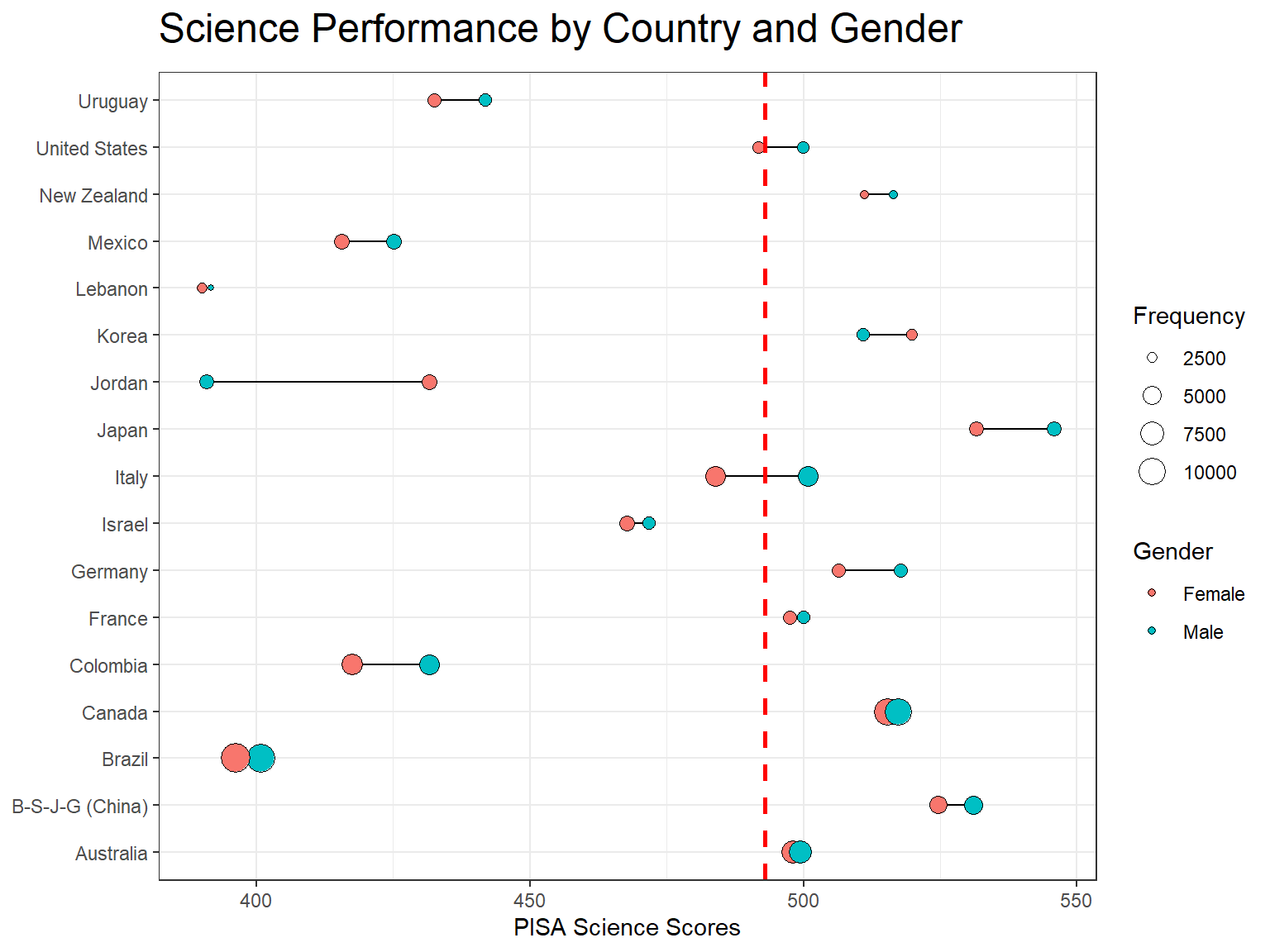
5.6 Plots for ordinal/categorical variables
An alluvial plot can be used to summarize relationships between multiple categorical variables. In the following example, we use region (Region), gender (sex), and a survey item regarding whether parents support educational efforts and achievements (ST123Q02NA). We first create a new dataset called dat_alluvial to have frequency counts by region, gender, and our survey item. Because the survey item includes missing values, we label them as “missing” and then recode this variable as a factor with re-ordered levels.
dat_alluvial <- dat[,
                    .(Freq = .N),
                    by = c("Region", "sex", "ST123Q02NA")
                    ][,
                      ST123Q02NA := as.factor(ifelse(ST123Q02NA == "", "Missing", ST123Q02NA))
                      ]
levels(dat_alluvial$ST123Q02NA) <- c("Strongly disagree", "Disagree", "Agree",
                                     "Strongly agree", "Missing")

head(dat_alluvial)
## Region sex ST123Q02NA Freq
## 1: Australia Female Disagree 232
## 2: Australia Female Strongly disagree 2773
## 3: Australia Female Strongly agree 5981
## 4: Australia Male Strongly disagree 3209
## 5: Australia Male Strongly agree 5626
## 6: Australia Male Missing 186Unlike the previous visualizations, there is a new layer called geom_alluvium, which allows creating an alluvial plot using the ggplot function. We use aes(fill = sex) inside geom_alluvium to differentiate the frequencies by gender.
# StatStratum <- StatStratum
ggplot(data = dat_alluvial,
       aes(axis1 = Region, axis2 = ST123Q02NA, y = Freq)) +
  scale_x_discrete(limits = c("Region", "Parents supporting\nachievement"),
                   expand = c(.1, .05)) +
  geom_alluvium(aes(fill = sex)) +
  geom_stratum() +
  geom_text(stat = "stratum", label.strata = TRUE) +
  labs(x = "Demographics", y = "Frequency", fill = "Gender") +
  theme_bw()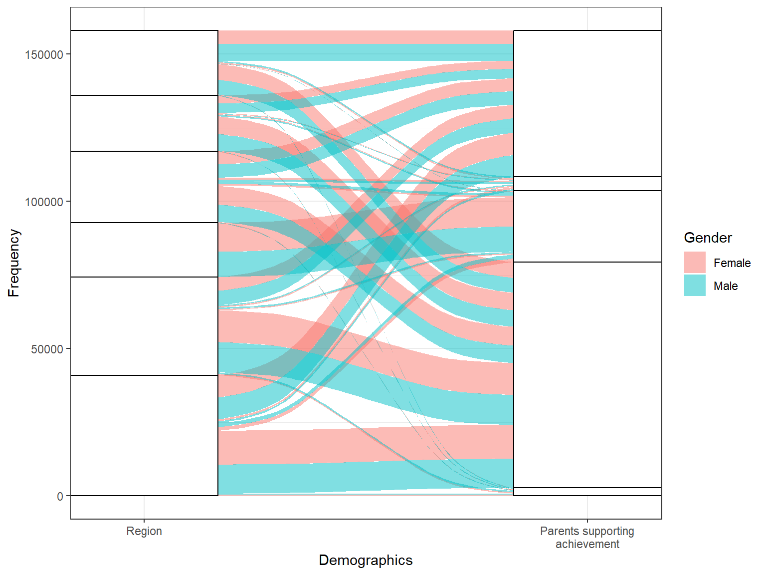
Interpretation:
- Does parents’ support for educational efforts and achievement vary by region and gender?
5.6.1 Exercise
Create an alluvial plot for the survey item (ST119Q01NA) of whether students want top grades in most or all courses by region (Region) and gender (sex). Below we create the summary dataset (dat_alluvial2) for this plot. Use this dataset to draw the alluvial plot plot. How should we interpret the plot (e.g., for each region)?
dat_alluvial2 <- dat[,
                     .(Freq = .N),
                     by = c("Region", "sex", "ST119Q01NA")
                     ][,
                       ST119Q01NA := as.factor(ifelse(ST119Q01NA == "", "Missing", ST119Q01NA))]

levels(dat_alluvial2$ST119Q01NA) <- c("Strongly disagree", "Disagree", "Agree",
                                      "Strongly agree", "Missing")
5.7 Interactive plots with plotly
Using the plotly package, we can make more interactive visualizations. The ggplotly function from the plotly package transforms a ggplot2 plot into an interactive plot in the HTML format. In the following example, we first save a boxplot as p3 and then insert this plot into the plotly function in order to generate an interactive plot. As we hover the pointer over the plot area, the plot shows the min, max, q1, q3, and median values.
p3 <- ggplot(data = dat,
             mapping = aes(x = CNT, y = science, fill = Region))+
  geom_boxplot() +
  facet_grid(. ~ sex)+
  labs(x = NULL, y = "Science Scores", fill = "Region") +
  coord_flip() +
  theme_bw()

ggplotly(p3)
Similarly, we can transform our bubble chart into an interactive plot using ggplotly().
p4 <- ggplot(data = science_summary,
       mapping = aes(x = CNT, y = Science, size = Freq, fill = sex)) +
  geom_point(shape = 21) +
  coord_flip() +
  theme_bw() +
  labs(x = NULL, y = "Science Scores", fill = "Gender",
       size = "Frequency")

ggplotly(p4)
We can also use the plot_ly function to create interactive visualizations, without using `ggplot2. In the following example, we create a scatterplot of reading scores and science scores where the color of the dots will be based on region and the size of the dots will be based on student weight in the PISA database. Because the resulting figure is interactive, we can click on the legend and hide some regions as we review the plot. In addition, we add a hover text (text = ~paste("Reading: ", reading, '<br>Science:', science)) into the plot. As we hover on the plot, it will show us a label with reading and science scores.
plot_ly(data = dat_small,
        x = ~reading, y = ~science, color = ~Region,
        size = ~W_FSTUWT,
        type = "scatter",
        text = ~paste("Reading: ", reading, '<br>Science:', science))
Lastly, we create a bar chart showing average science scores by region and gender. We will also include error bars in the plot. First we will create a new dataset science_region with the mean and standard deviation values by gender and region. Then, we will use this summary dataset in plot_ly() to draw a bar chart for females and save it as p5. Finally, we will add a new layer for males using add_trace.
science_region <- dat[, .(Science = mean(science, na.rm = TRUE),
                          SD = sd(science, na.rm = TRUE)),
                        by = c("sex", "Region")]

p5 <- plot_ly(data = science_region[which(science_region$sex == 'Female'),],
        x = ~Region,
        y = ~Science,
        type = 'bar',
        name = 'Female',
        error_y = ~list(array = SD, color = 'black'))

add_trace(p5, data = science_region[which(science_region$sex == 'Male'),],
          name = 'Male')
Check out the plotly website to see more interesting examples of interactive visualizations and dashboards.
5.7.1 Exercise
Replicate the science-by-region histogram below as a density plot and useplotly to make it interactive. You will need to replace geom_histogram(alpha = 0.5, bins = 50) with geom_density(alpha = 0.5). Repeat the same process by changing alpha = 0.5 to alpha = 0.8. Which version is better for examining the science score distribution?
ggplot(data = dat,
       mapping = aes(x = science, fill = Region)) +
  geom_histogram(alpha = 0.5, bins = 50) +
  labs(x = "Science Scores", y = "Count",
       title = "Science Scores by Gender and Region") +
  facet_grid(. ~ sex) +
  theme_bw()
5.8 Customizing visualizations
Although ggplot2 has many ways to customize visualizations, sometimes making a plot ready for a publication or a presentation becomes quite tedious. Therefore, we recommend the cowplot package – which is capable of quickly transforming plots created with ggplot2 into publication-ready plots. The cowplot package provides a nice theme that requires a minimum amount of editing for changing sizes of axis labels, plot backgrounds, etc. In addition, we can add custom annotations to ggplot2 plots using cowplot (see the cowplot vignette for more details).
On of the plots that we created earlier was a bubble chart by gender and frequency.
ggplot(data = science_summary,
       mapping = aes(x = CNT, y = Science, size = Freq, fill = sex)) +
  geom_point(shape = 21) +
  coord_flip() +
  theme_bw() +
  labs(x = NULL, y = "Science Scores", fill = "Gender",
       size = "Frequency")
After we load the cowplot package and remove theme_bw from the plot, it will change as follows:
library("cowplot")

plot1 <-
  ggplot(data = science_summary,
         mapping = aes(x = CNT, y = Science, size = Freq, fill = sex)) +
  geom_point(shape = 21) +
  coord_flip() +
  labs(x = NULL, y = "Science Scores", fill = "Gender",
       size = "Frequency")

plot1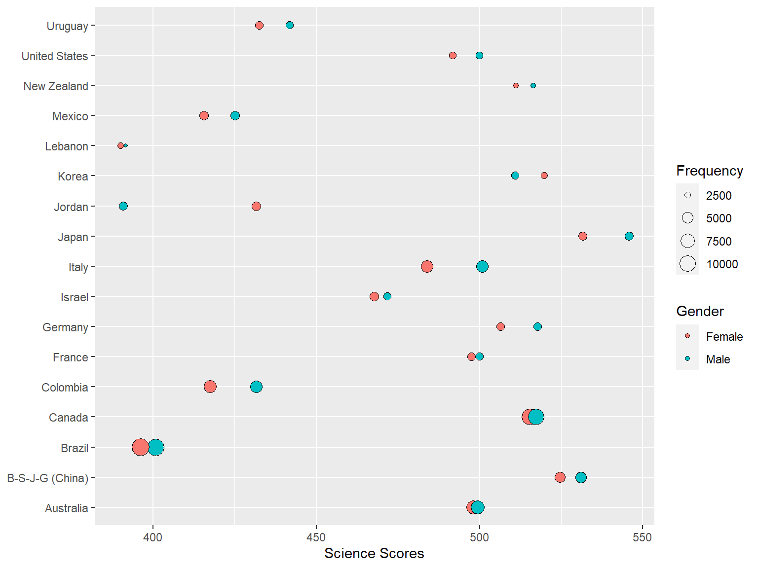
The cowplot package removes the gray background, gridlines, and make the axes more visible. If we want to save the plot, we can export it using save_plot.
save_plot("plot1.png", plot1,
          base_aspect_ratio = 1.6)
Also, cowplot enables combining two or more plots into one graph via the function plot_grid:
plot2 <-
  ggplot(data = science_summary,
         mapping = aes(x = CNT, y = Science, fill = sex)) +
  geom_bar(stat = "identity", position = "dodge") +
  coord_flip() +
  labs(x = "", y = "Science Scores", fill = "Gender")


plot_grid(plot1, plot2, labels = c("A", "B"))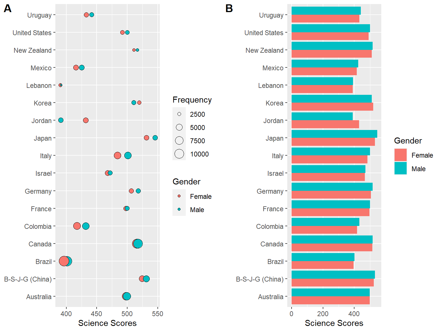
If you decide not to use the cowplot theme, you can just simply unload the package as follows:
detach("package:cowplot", unload=TRUE)5.9 Lab
We want to examine the relationships between reading scores and technology-related variables in the dat dataset that we created earlier. Create at least two visualizations (either static or interactive) using some of the variables shown below:
- Region
- sex
- grade
- HOMESCH
- ENTUSE
- ICTHOME
- ICTSCH
You can focus on a particular country or region or use the entire dataset for your visualizations.