5 Data Visualizations in R
5.1 Base R Graphics
When it comes to data visualization, R is a wonderful software program. We can create a wide range of visualizations, from simple scatterplots and histograms to animated or interactive graphics. Let’s start by drawing a few very simple graphs just to get a feel for what it’s like to draw pictures using base R functions. In each plot, there are several elements that we can modify:
main: Title for the figurexlab: Label for the x-axisylab: Label for the y-axis
There are also a bunch of graphical parameters that we can use to customise the font style:
Font styles:
font.main,font.sub,font.lab,font.axis. These four parameters control the font style used for the plot title (font.main), the subtitle (font.sub), the axis labels (font.lab: note that you can’t specify separate styles for the x-axis and y-axis without using low level commands), and the numbers next to the tick marks on the axis (font.axis). Somewhat irritatingly, these arguments are numbers instead of meaningful names: a value of 1 corresponds to plain text, 2 means boldface, 3 means italic and 4 means bold italic.Font colours:
col.main,col.sub,col.lab,col.axis. These parameters do pretty much what the name says: each one specifies a colour in which to type each of the different bits of text. Conveniently, R has a very large number of named colours (typecolours()to see a list of over 650 colour names that R knows), so you can use the English language name of the colour to select it. Thus, the parameter value here string like"red","gray25"or"springgreen4".Font size:
cex.main,cex.sub,cex.lab,cex.axis. Font size is handled in a slightly curious way in R. The “cex” part here is short for “character expansion,” and it’s essentially a magnification value. By default, all of these are set to a value of 1, except for the font title:cex.mainhas a default magnification of 1.2, which is why the title font is 20% bigger than the others.Font family:
family. This argument specifies a font family to use: the simplest way to use it is to set it to"sans","serif", or"mono", corresponding to a san serif font, a serif font, or a monospaced font. If you want to, you can give the name of a specific font, but keep in mind that different operating systems use different fonts, so it’s probably safest to keep it simple. Better yet, unless you have some deep objections to the R defaults, just ignore this parameter entirely.
5.1.1 Boxplots
boxplot(medical$depression1,
        main = "Depression Scores")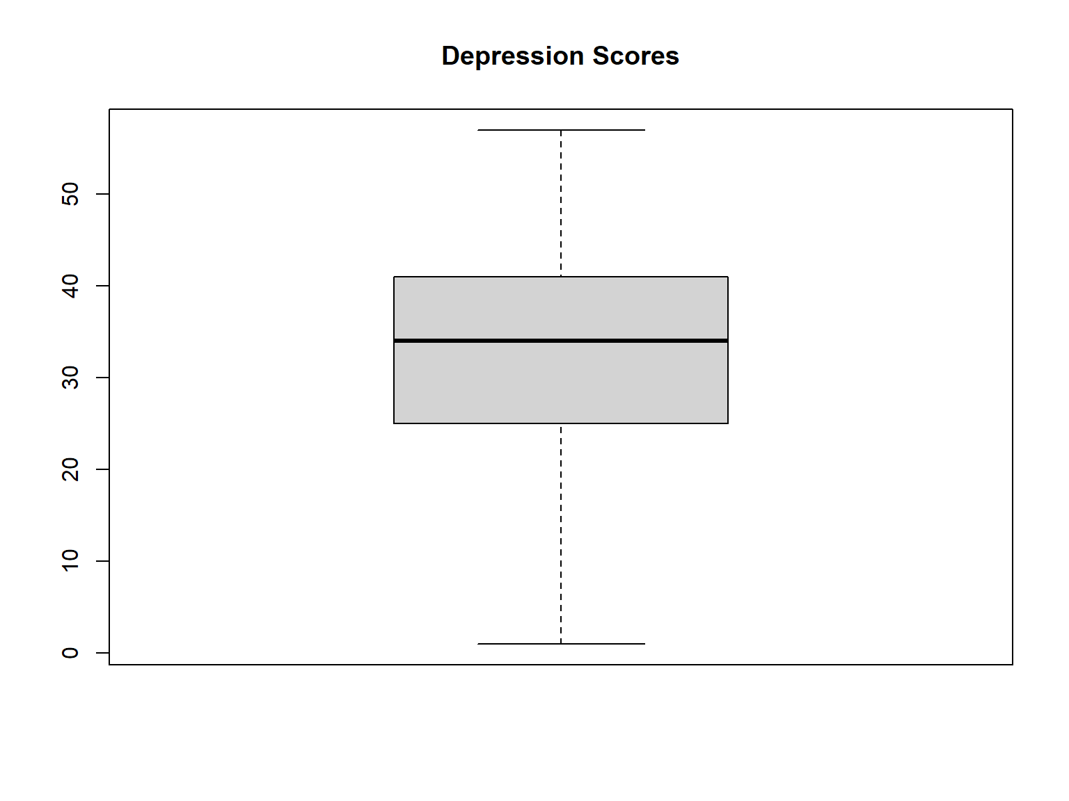
Figure 5.1: A boxplot example
What R draws is shown in the figure, the most basic boxplot possible. When we look at this plot, this is how we should interpret it: the thick line in the middle of the box is the median; the box itself spans the range from the 25th percentile to the 75th percentile; and the “whiskers” cover the full range from the minimum value to the maximum value. This is summarised in the annotated plot in Figure 5.2.
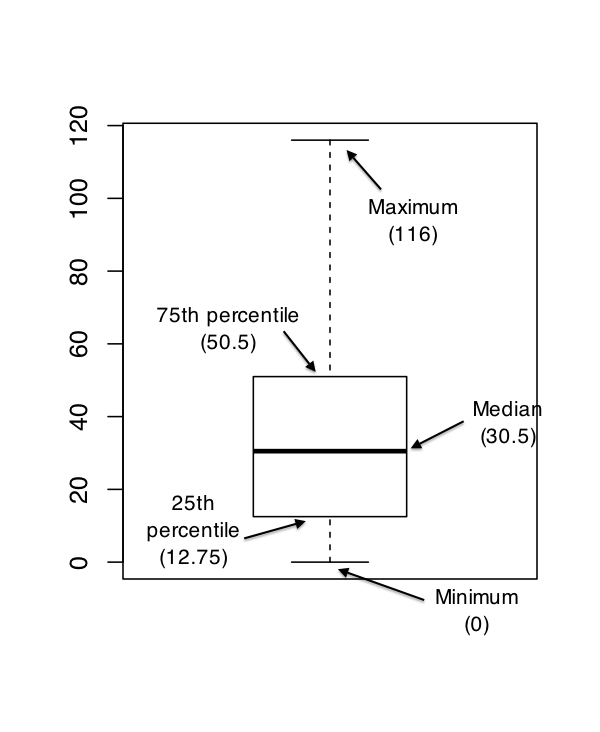
Figure 5.2: An annotated boxplot
We can also create the boxplots by a grouping variable. For this, we have to use a formula rather than a single variable. Let’s create a boxplot of depression scores by sex.
boxplot(formula = depression1 ~ sex,
        data = medical,
        main = "Depression Scores by Sex",
        ylab = "Depression at the baseline",
        names = c("Female", "Male"))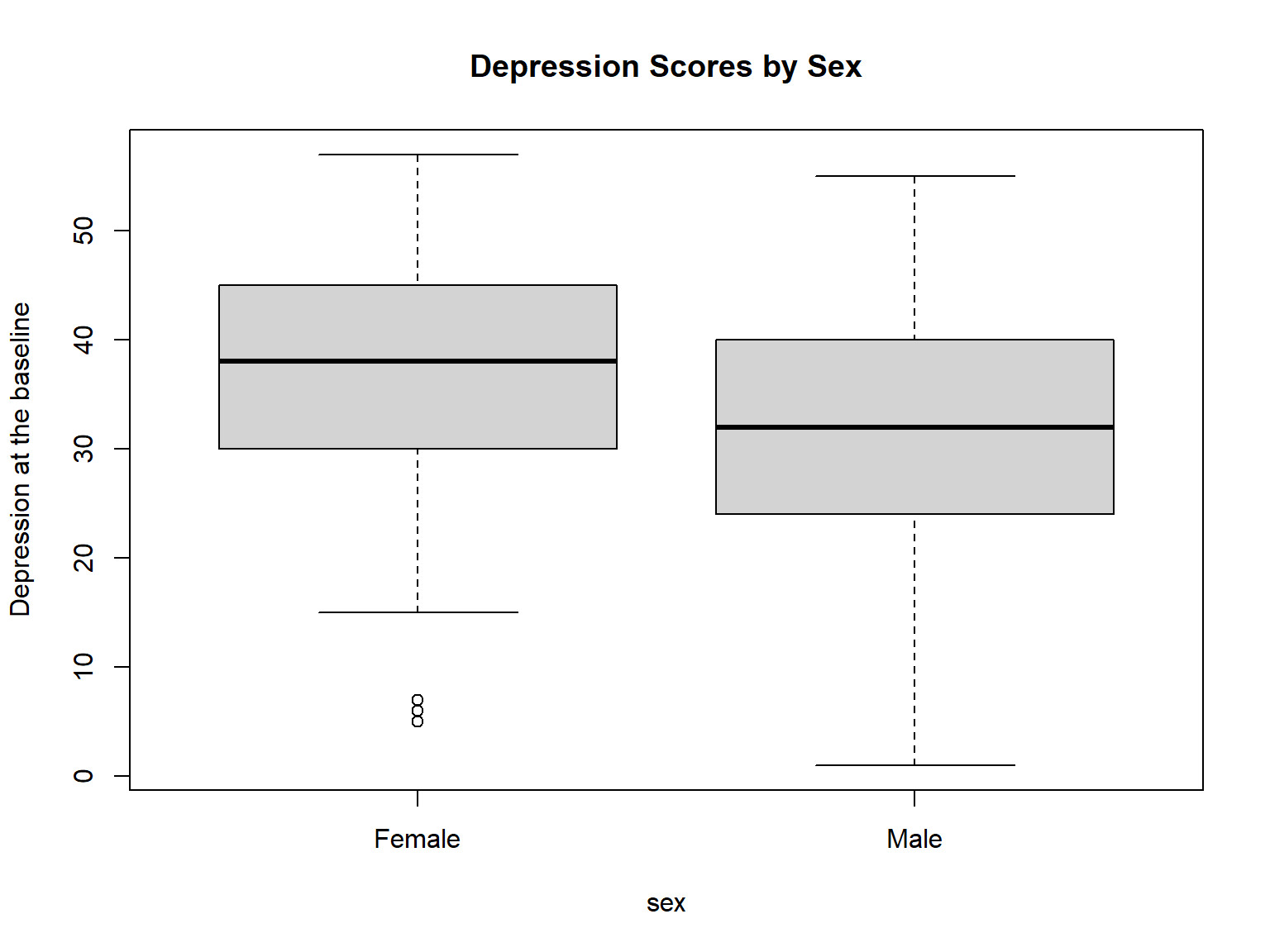
Figure 5.3: A boxplot by a grouping variable
5.1.2 Histograms
hist(medical$depression1,
     main = "Depression Scores at the Baseline",
     xlab = "Depression")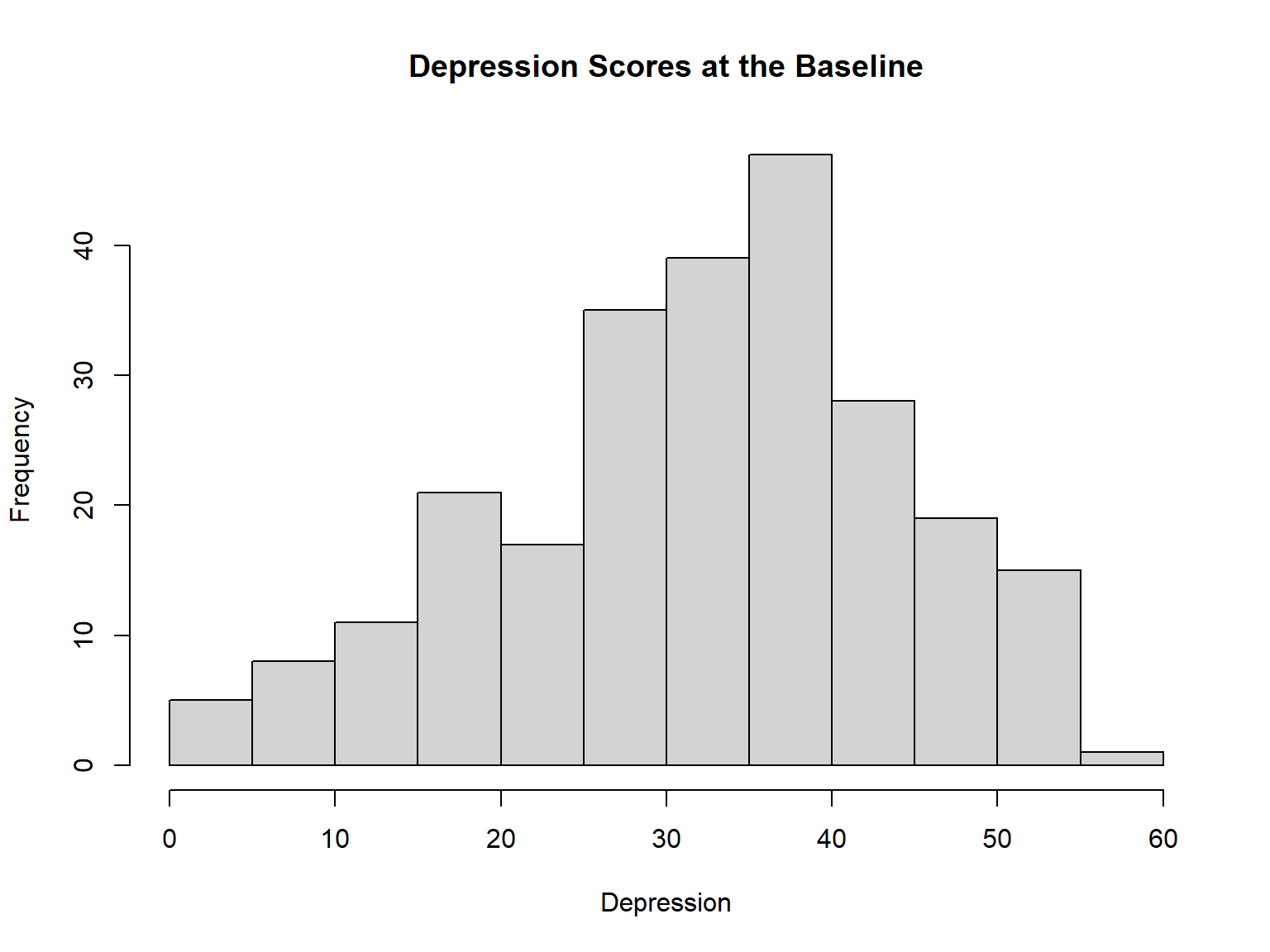
Figure 5.4: A histogram example
5.1.3 Bar Graphs
Bar plots are essentially histograms for categorical variables (e.g., sex, race, etc.). Before we create a bar plot, we need to make sure that our categorical variables are “factors.” Otherwise, R attempts to treat such variables as quantative and thus fails to return a plot.
# Let's save race as a factor
medical$race <- as.factor(medical$race)

# Create a bar graph for race
plot(medical$race,
     main = "Race Groups in the medical Dataset",
     xlab = "Race",
     ylab = "Count")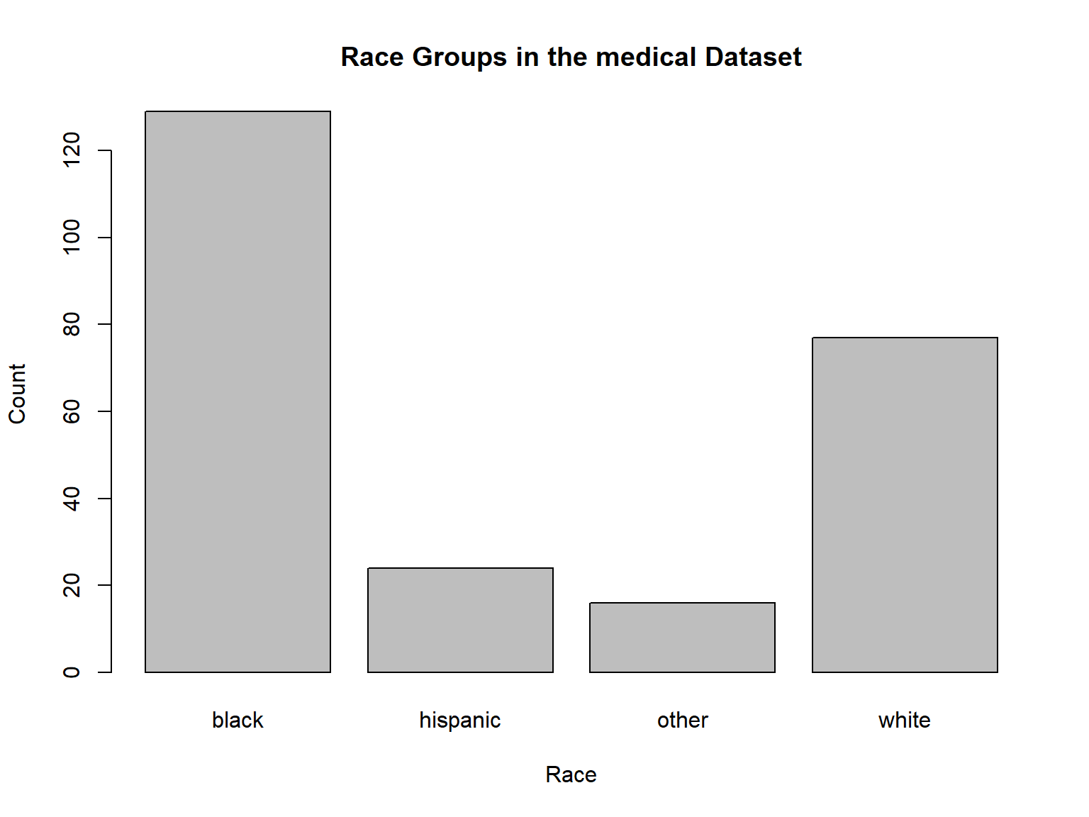
Figure 5.5: A bar graph example
5.1.4 Scatterplots
A scatterplot of depression scores at the baseline (depression1) against depression scores after 6 months (depression2):
plot(medical$depression1, medical$depression2,
     xlab = "Depression at the baseline",
     ylab = "Depression after 6 months",
     main = "Scatterplot of Depression Scores")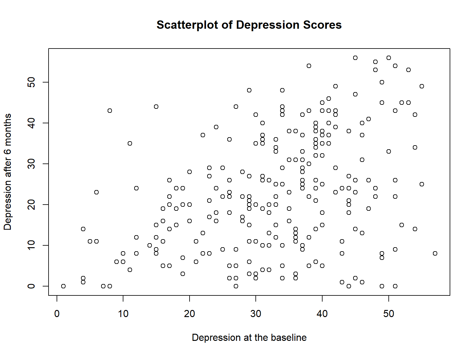
Figure 5.6: A scatterplot example
We can customise the appearance of the actual plot. To start with, let’s look at the single most important options that the plot() function provides for us to use, which is the type argument. The type argument specifies the visual style of the plot. The possible values for this are:
type = "p". Draw the points onlytype = "l". Draw a line through the pointstype = "o". Draw the line over the top of the pointstype = "b". Draw both points and lines, but don’t overplottype = "h". Draw “histogram-like” vertical barstype = "s". Draw a staircase, going horizontally then verticallytype = "S". Draw a Staircase, going vertically then horizontallytype = "c". Draw only the connecting lines from the “b” versiontype = "n". Draw nothing
The simplest way to illustrate what each of these really looks like is just to draw them. Figure 5.7 shows a scatterplot using six different types of plot. As you can see, by altering the type argument we can get a qualitatively different appearance to our plot.
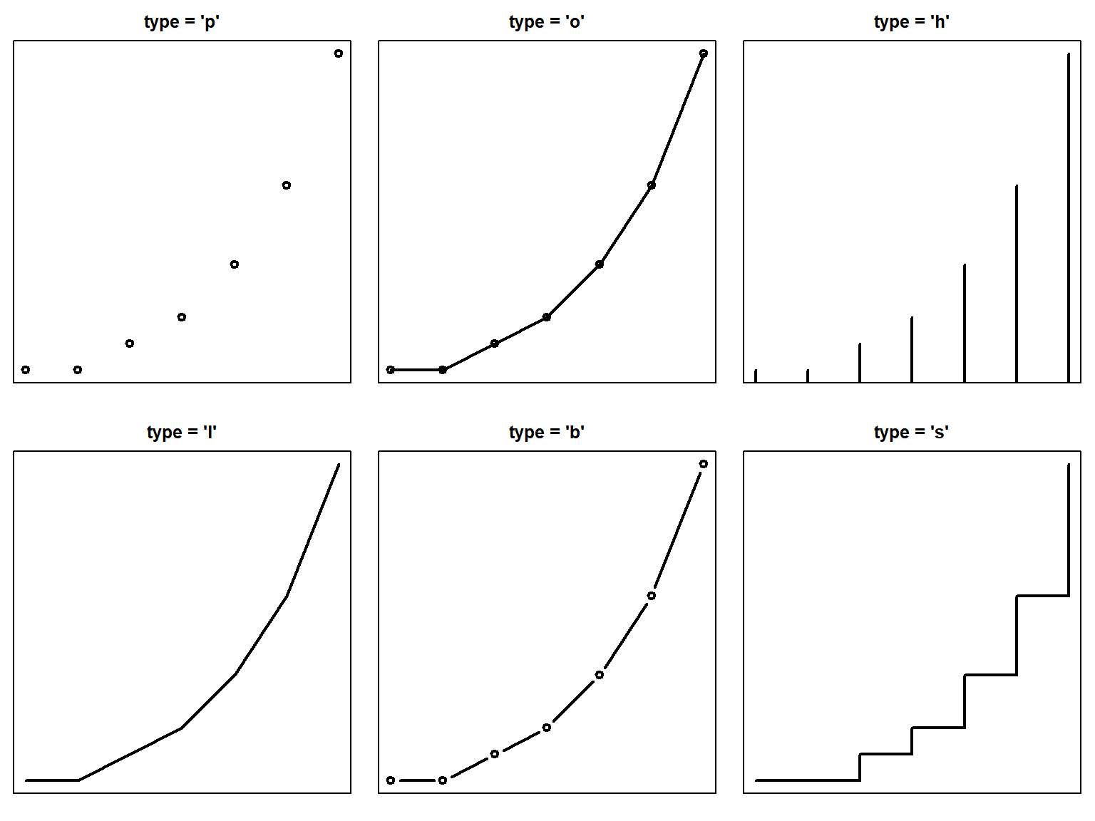
Figure 5.7: Changing the type of the plot.
5.1.5 Scatterplots + Boxplots
The scatterplot function from the car package (Fox, Weisberg, and Price 2020) gives a nice plot that includes boxplots for individual variables and a scatterplot of the two variables together.
# Install and activate the car package
install.packages("car")
library("car")

scatterplot(depression1 ~ depression2,
            data = medical,
            smooth = FALSE)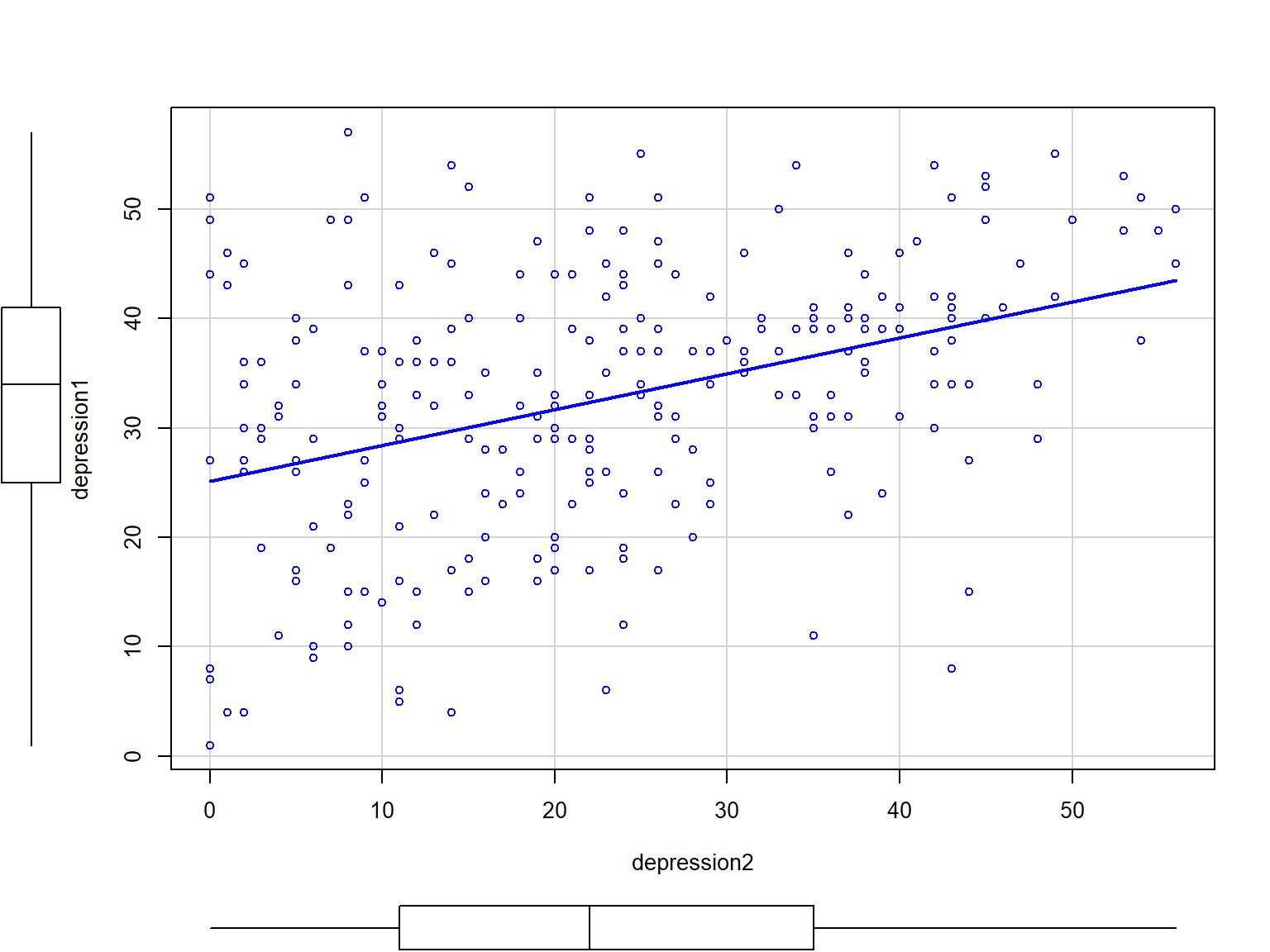
Figure 5.8: A scatterplot along with boxplots
5.1.6 Scatterplot Matrix
Often we find yourself wanting to look at the relationships between several variables at once. One useful tool for doing so is to produce a “scatterplot matrix,” analogous to the correlation matrix. We can create a scatterplot matrix using the pairs function in base R. Let’s take a look at the following variables: depression1, mental1, and physical1.
pairs(formula = ~ depression1 + mental1 + physical1,
      data = medical,
      main = "Scatterplot Matrix with Three Scores")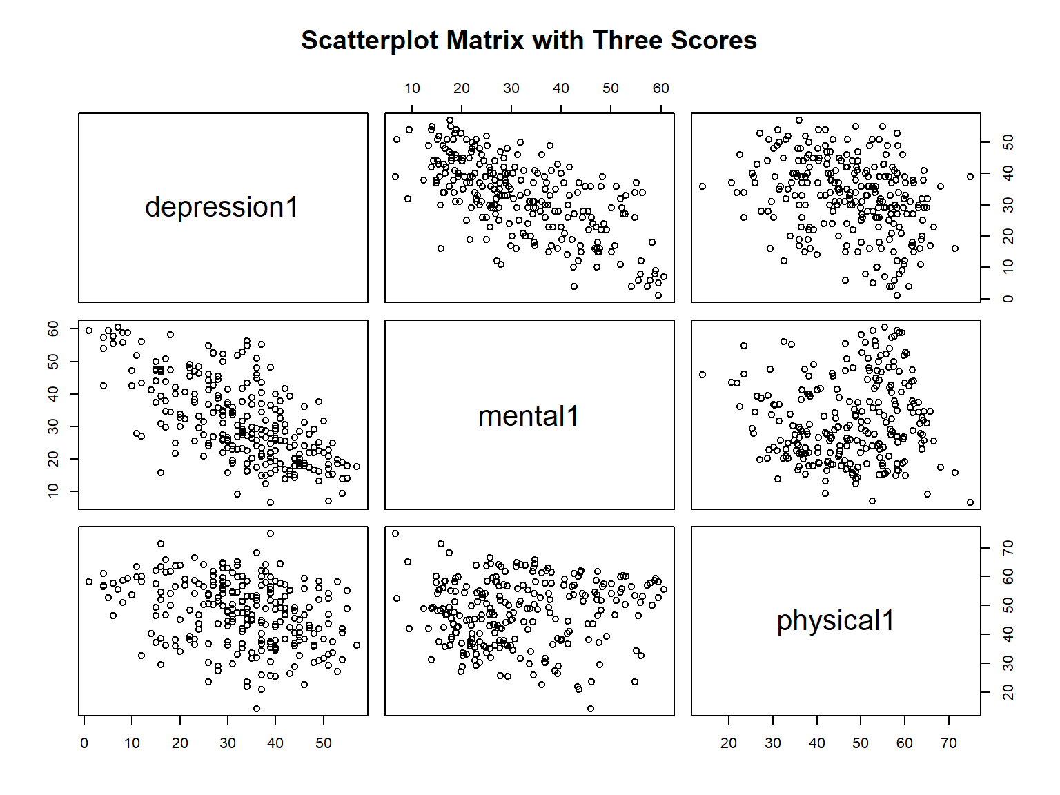
Figure 5.9: A scatterplot matrix from the pairs() function
5.1.7 Saving Base R Figures
We can save figures generated by base R functions in several ways:
jpeg("filename.jpg")png("filename.jpng")pdf("filename.pdf")tiff("filename.tif")
For example, to save our plot using .jpg format, we would do:
jpeg("myplot.jpg", width = 8, height = 4, units = "in", res = 300)
plot(medical$depression1, medical$depression2)
dev.off()
where width and height are dimensions in inches (units = "in") and resolution is 300 dpi.
5.1.8 Exercise 7
Here you will create two plots:
A boxplot of
mental1(i.e., mental test scores at the baseline) bysubstance(i.e., type of substance being used). Do you see any differences between the mental test scores of the three substance groups?A scatterplot of
depression1againstmental1. You need to see the depression scores on the x-axis and the mental test scores on the y-axis. What type of relationship do you see between the two variables (e.g., negative, positive, or no relationship)?
5.2 ggplot2 Graphics
5.2.1 What is ggplot2?
- A comprehensive data visualization package in R
- Popular method for creating explanatory graphics
- Simpler than base R graphics due its multi-layer approach
- Many other supplementary packages using the
ggplot2platform
5.2.2 How ggplot2 works?
The ggplot2 package (Wickham et al. 2020) follows data visualization rules known as “The Grammar of Graphics.” The grammar tells us that a statistical graphic is a mapping of data variables to aesthetic attributes of geometric objects.
Specifically, we can break a graphic into the following three essential components:
data: the data set composed of variables that we map.geom: the geometric object in question. This refers to the type of object we can observe in a plot. For example: points, lines, and bars.aes: aesthetic attributes of the geometric object. For example, color, shape, and size. Each assigned aesthetic attribute can be mapped to a variable in our data set.
Figure 5.10 shows these three components are laid out in a typical ggplot2 function. As we can see, each part (e.g., geom_function) is added to the plot using a plus sign. That is, each layer like that brings an additional functionality into the plot we are drawing.
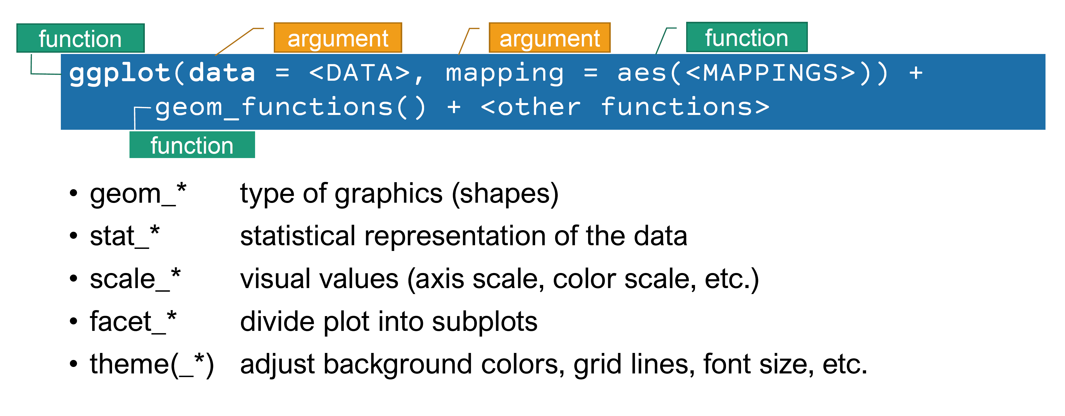
Figure 5.10: How the elements of ggplot2 work
In order to keep things simple, we will only take a look at the following types of graphics in ggplot2:
- scatterplots
- boxplots
- histograms
- bar plots
For more information on ggplot2, check out http://ggplot2.tidyverse.org/.
5.2.3 Scatterplots
# Activate the package first
library("ggplot2")

ggplot(data = medical,
       mapping = aes(depression1, depression2)) +
  geom_point(size = 3) +
  labs(x = "Depression (Baseline)",
       y = "Depression (6 months)") +
  theme_bw() # for black & white theme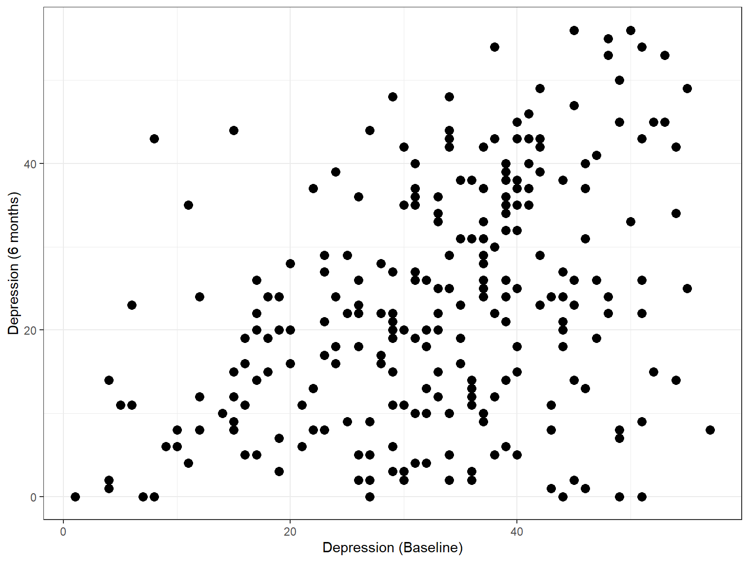
Figure 5.11: A scatterplot example with ggplot2
ggplot(data = medical,
       mapping = aes(depression1, depression2, colour = sex)) +
  geom_point(size = 3) +
  geom_smooth(method = lm, color = "red", se = TRUE) +
  labs(colour = "Sex",
       x = "Depression (Baseline)",
       y = "Depression (6 months)") +
  theme_bw() # for black & white theme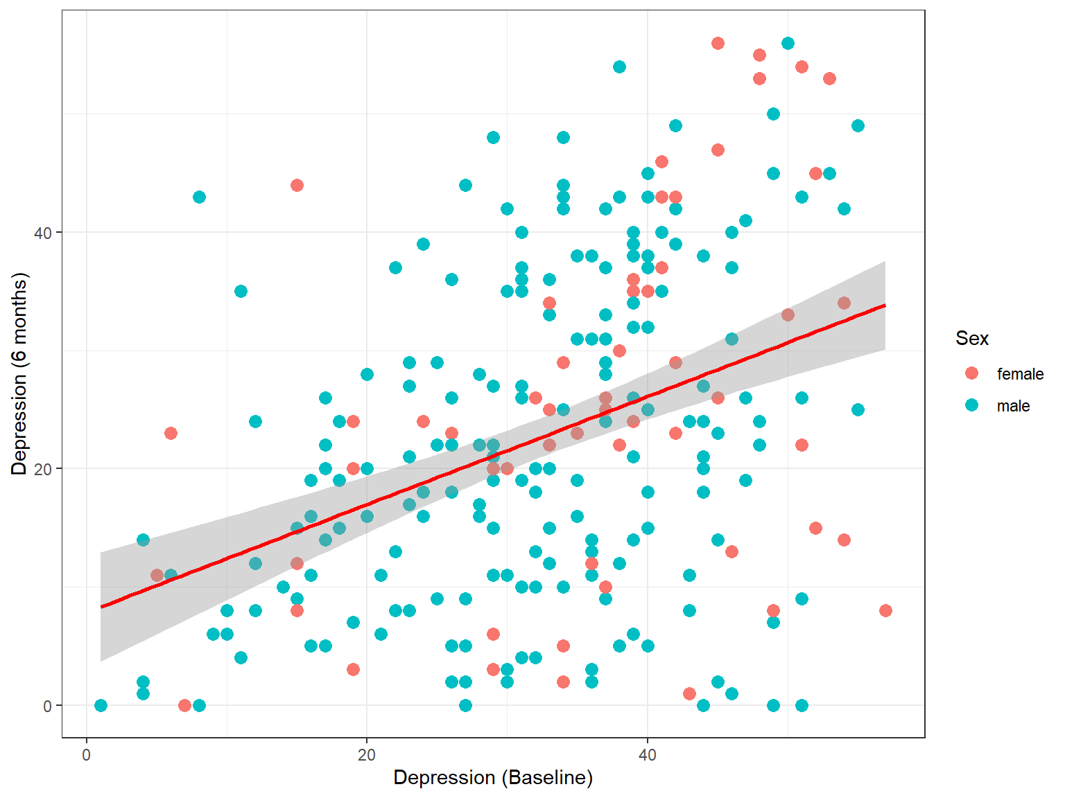
Figure 5.12: A scatterplot example with ggplot2 (With regression line)
5.2.4 Boxplots
ggplot(data = medical,
       mapping = aes(x = sex, y = depression1, fill = race)) +
  labs(x = "Sex",
       y = "Depression at the baseline",
       fill = "Race") +
  geom_boxplot() +
  theme_bw()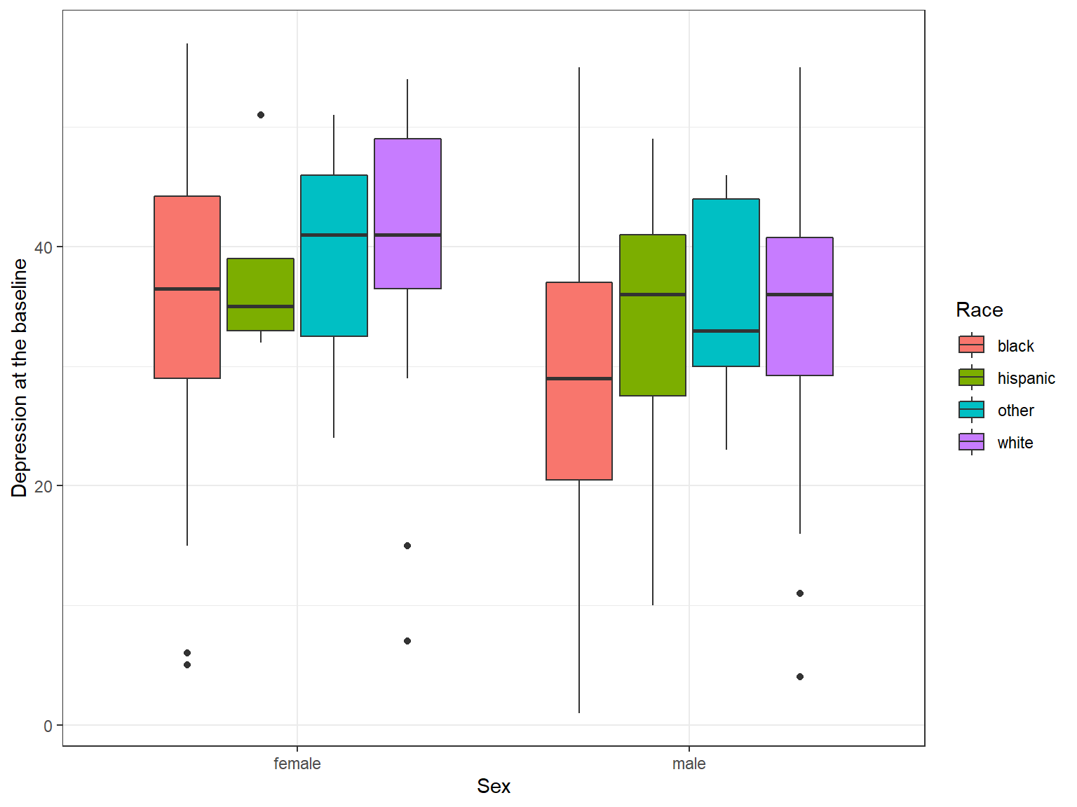
Figure 5.13: A boxplot example with ggplot2
5.2.5 Histograms
ggplot(data = medical,
       mapping = aes(x = depression1)) +
  labs(x = "Depression at the baseline",
       y = "Frequency",
       title = "Depression Scores at the the Baseline") +
  geom_histogram(color = "white", # color of bar lines
                 fill = "steelblue", # filling color
                 bins = 40) + # number of bins
  theme_bw()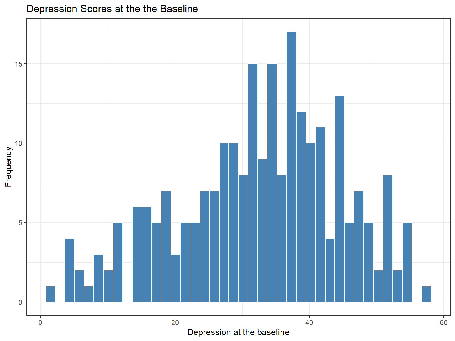
Figure 5.14: A histogram example with ggplot2
5.2.6 Bar Plots
ggplot(data = medical,
       mapping = aes(x = race)) +
  labs(x = "Race",
       y = "Frequency") +
  geom_bar(color = "white",
           fill = "orange") +
  theme_bw()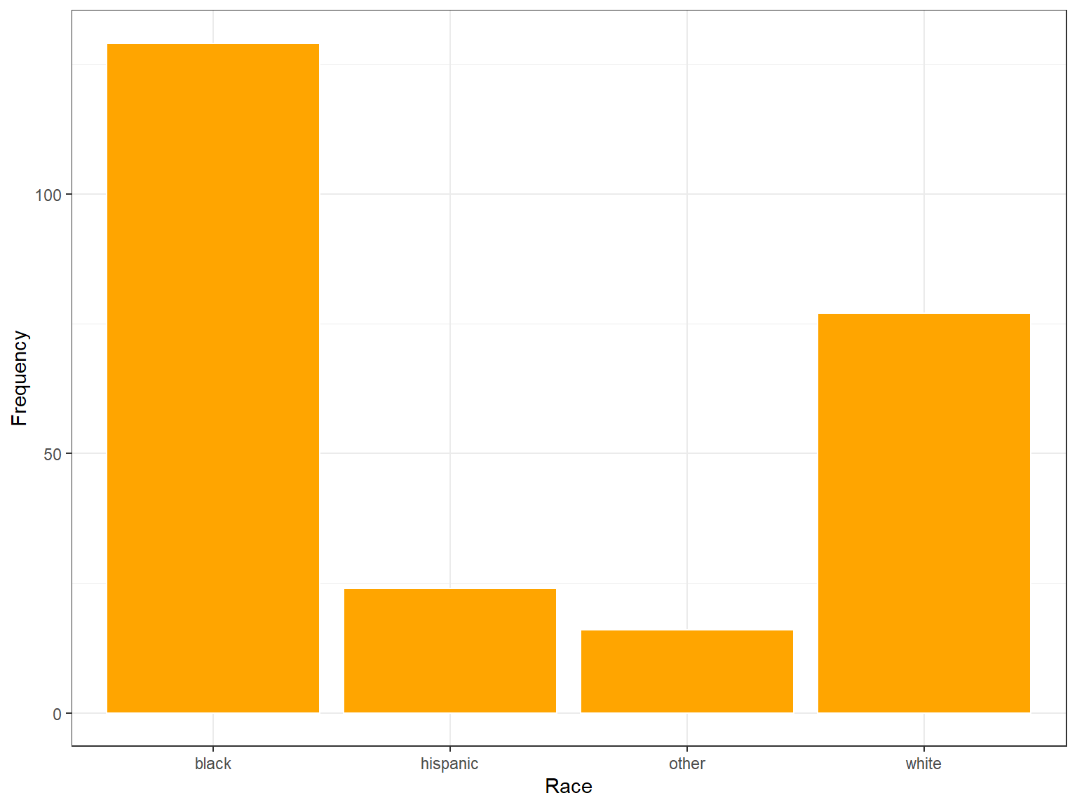
Figure 5.15: A bar plot example with ggplot2
ggplot(data = medical,
       mapping = aes(x = race, fill = sex)) +
  labs(x = "Race",
       y = "Frequency") +
  geom_bar() +
  theme_bw()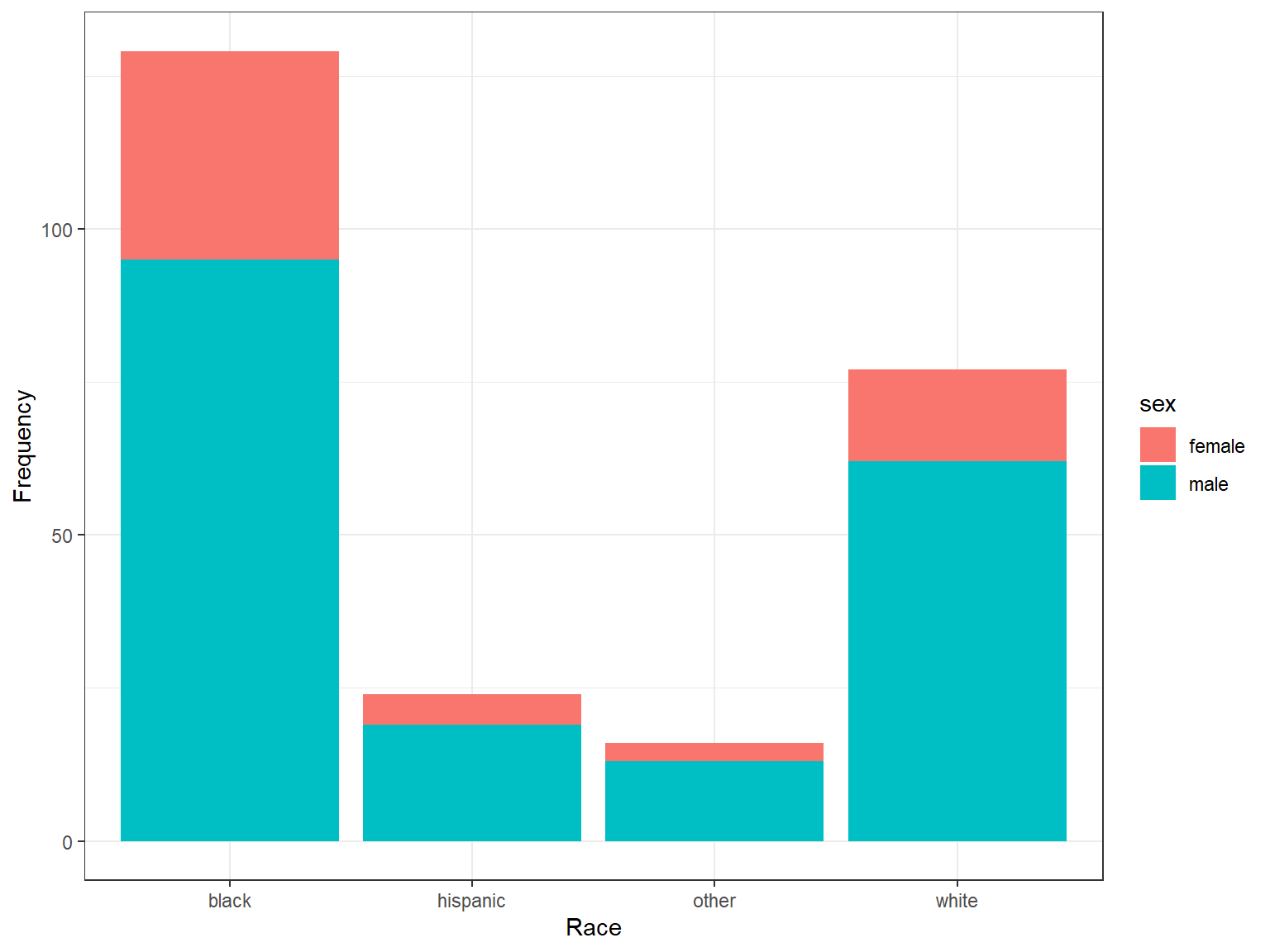
Figure 5.16: A bar plot example with ggplot2 (stacked bar chart)
ggplot(data = medical,
       mapping = aes(x = race, fill = sex)) +
  labs(x = "Race",
       y = "Frequency") +
  geom_bar(position = "dodge") +
  theme_bw()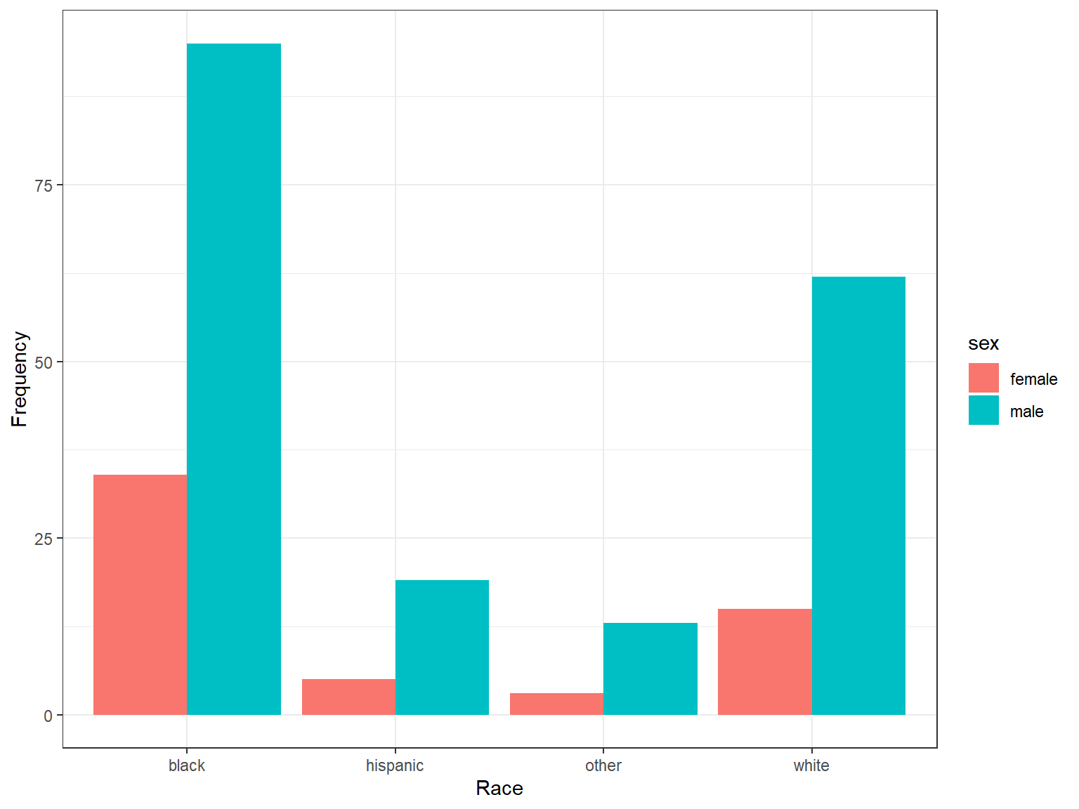
Figure 5.17: A bar plot example with ggplot2 (side-by-side bars)
ggplot(data = medical,
       mapping = aes(x = race, fill = sex)) +
  labs(x = "Race",
       y = "Frequency") +
  geom_bar(position = "dodge") +
  facet_wrap(. ~ sex) +
  theme_bw()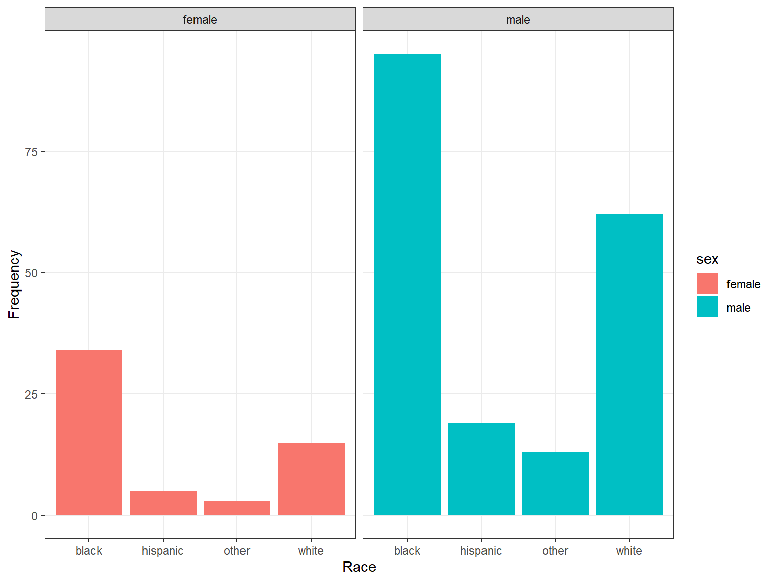
Figure 5.18: A bar plot example with ggplot2 (faceted)
5.2.7 Exercise 8
Here you will create a scatterplot of depression1 and mental1 using geom_point(), with
- point colours set by
sex(i.e.,colour = sex) - faceted by
substance(i.e.,facet_wrap(. ~ substance))
Do sex or substance seem to affect the relationship between depression1 and mental1?